Children’s Health Ireland
Children’s Health Ireland (CHI) is the largest healthcare provider for children in Ireland. Every year, the organisation releases an annual report that provides an overview of its accomplishments and challenges throughout the year. In 2020, CHI approached a design agency to help them create a report that would not only reflect the organisation’s achievements but also inspire and connect with its audience. I was hired by the agency to bring the report to life.
The primary objective of the project was to design an annual report that would communicate CHI’s progress and impact to date in a clear and compelling manner. The report should be visually appealing, easy to read, a bit of fun and accessible to a broad audience, including donors, stakeholders, and the general public.
.
Concept
Design
Creative Direction
Layout
Initial concepts
On behalf of the design agency I began by conducting research on CHI’s brand identity, audience, and other messaging. I reviewed previous reports, analysed CHI’s communication strategies, and conducted stakeholder interviews to gain insights into the organisation’s values and goals.
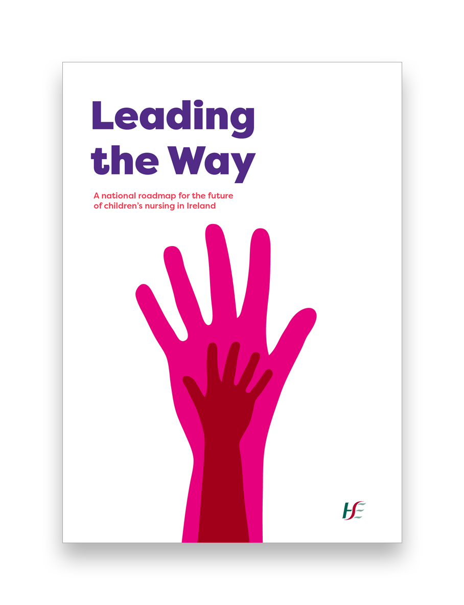
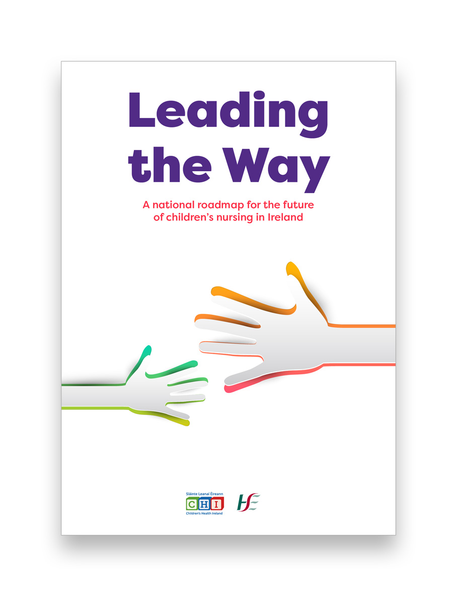
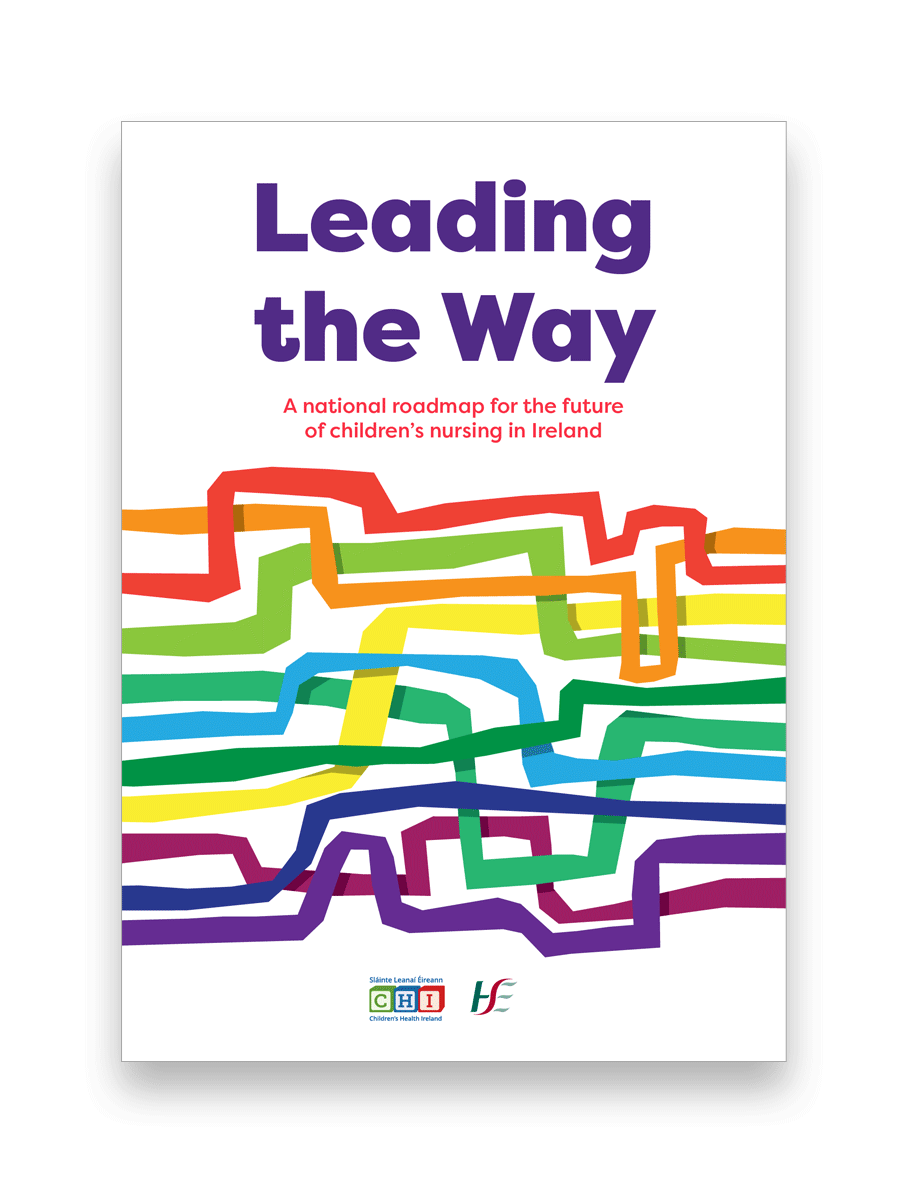
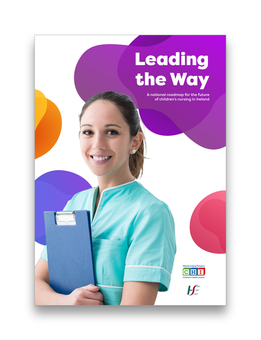
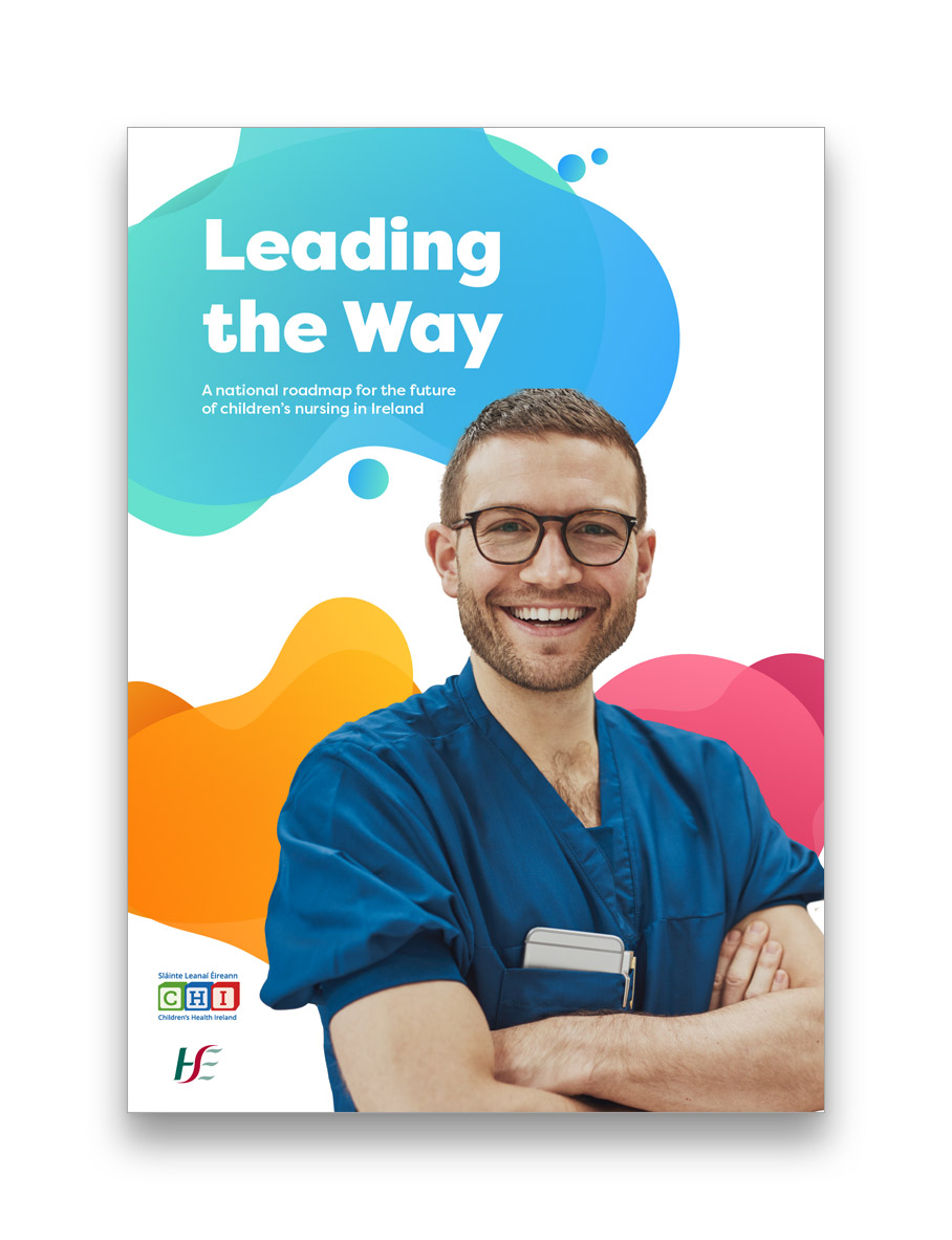
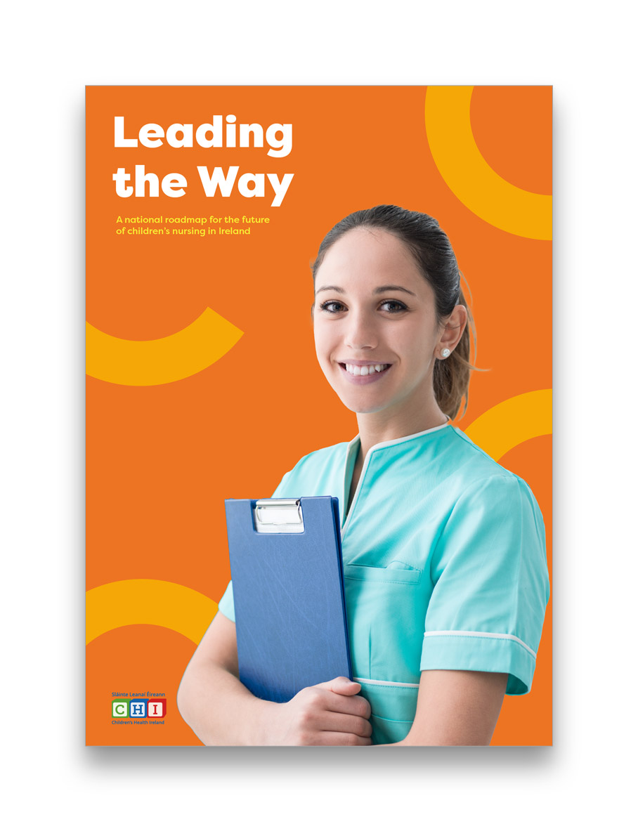
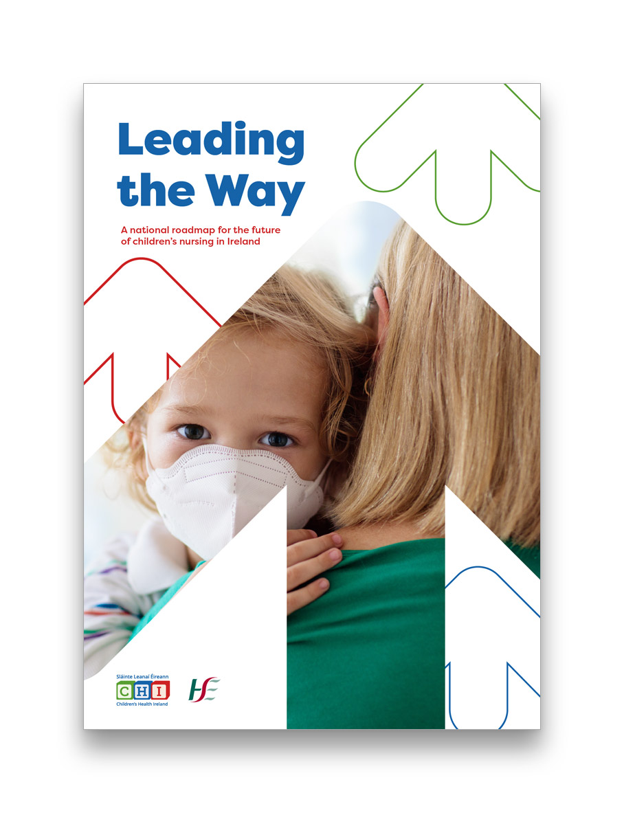
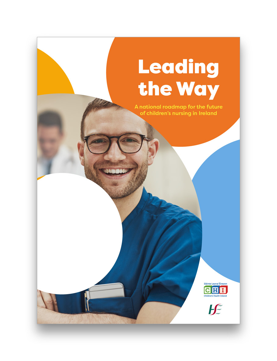
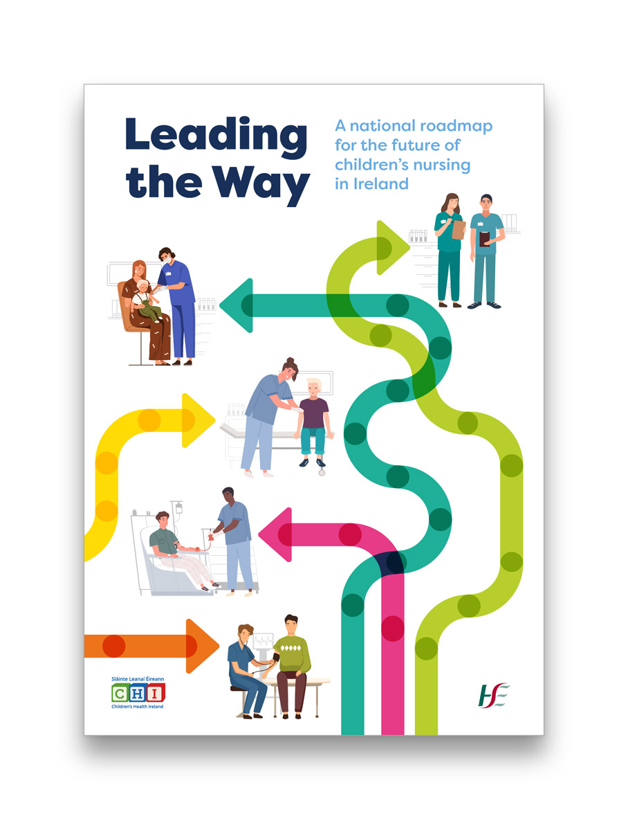
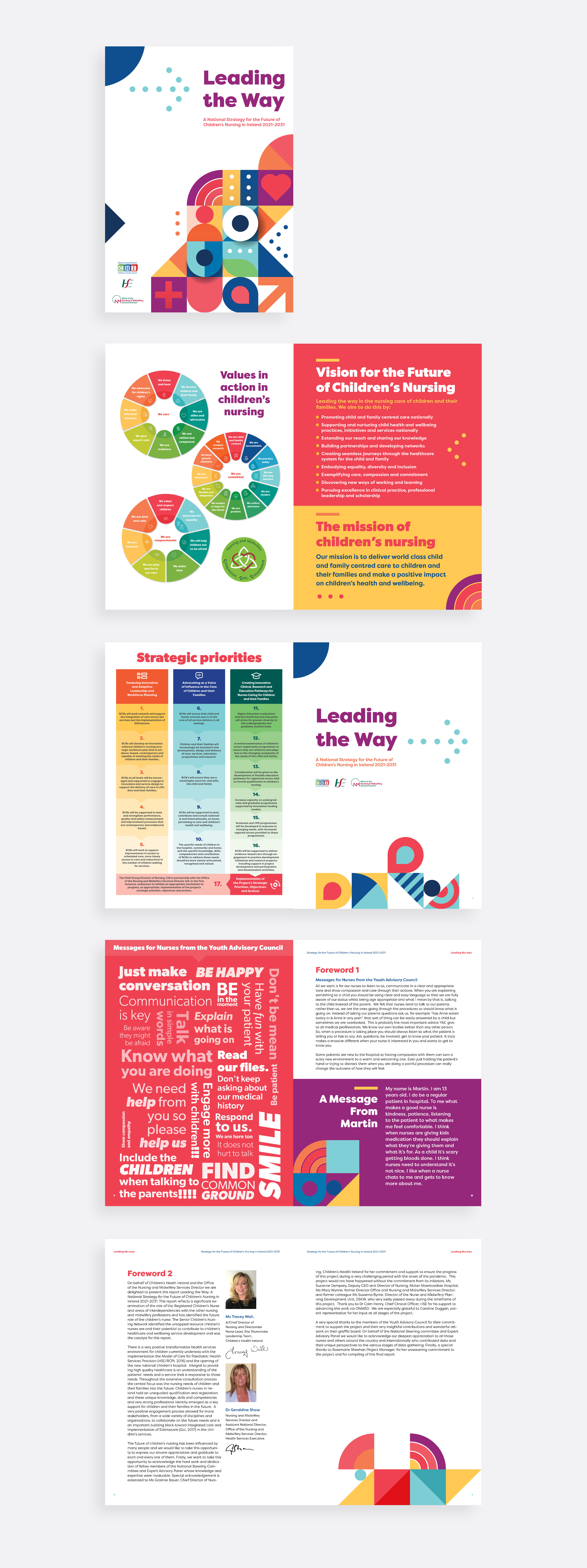
Based on their research, I developed several concepts that focused around the theme of ‘Leading the Way’. These concepts took the form of covers which became jumping off points for some internal page concepts.

Final Design
In the end the client chose the children’s building brick concept as it used a playful concept and bright colour palette. This ensured the report would never be visually far from the theme of children’s health. Using the building bricks motifs I enclosed the organisation’s accomplishments and highlights of the impact of CHI’s work on the lives of children and their families.
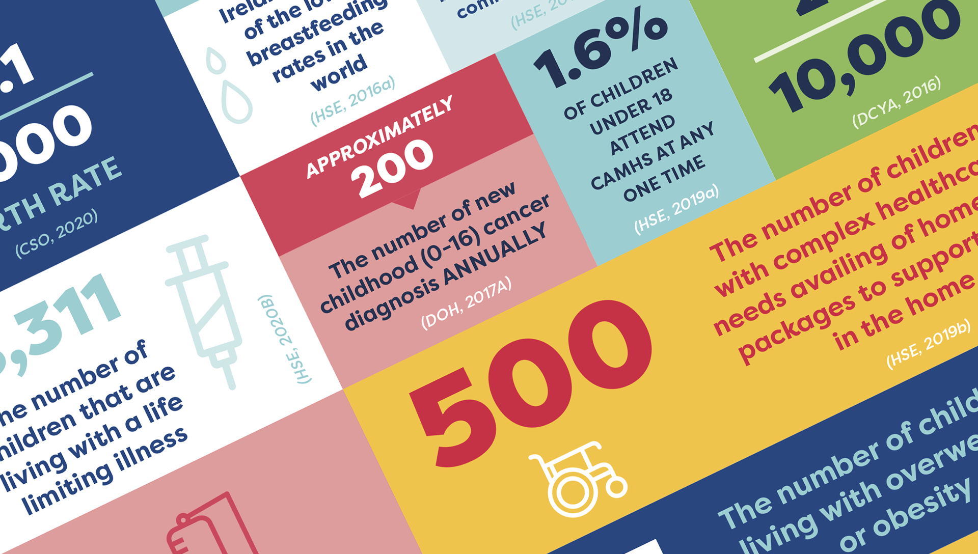
Soft humanist typefaces were used to create a sense of playful energy and optimism in what can be difficult and challenging work. I also incorporated infographics and data visualisations to make complex information more accessible and digestible.


Section breaks
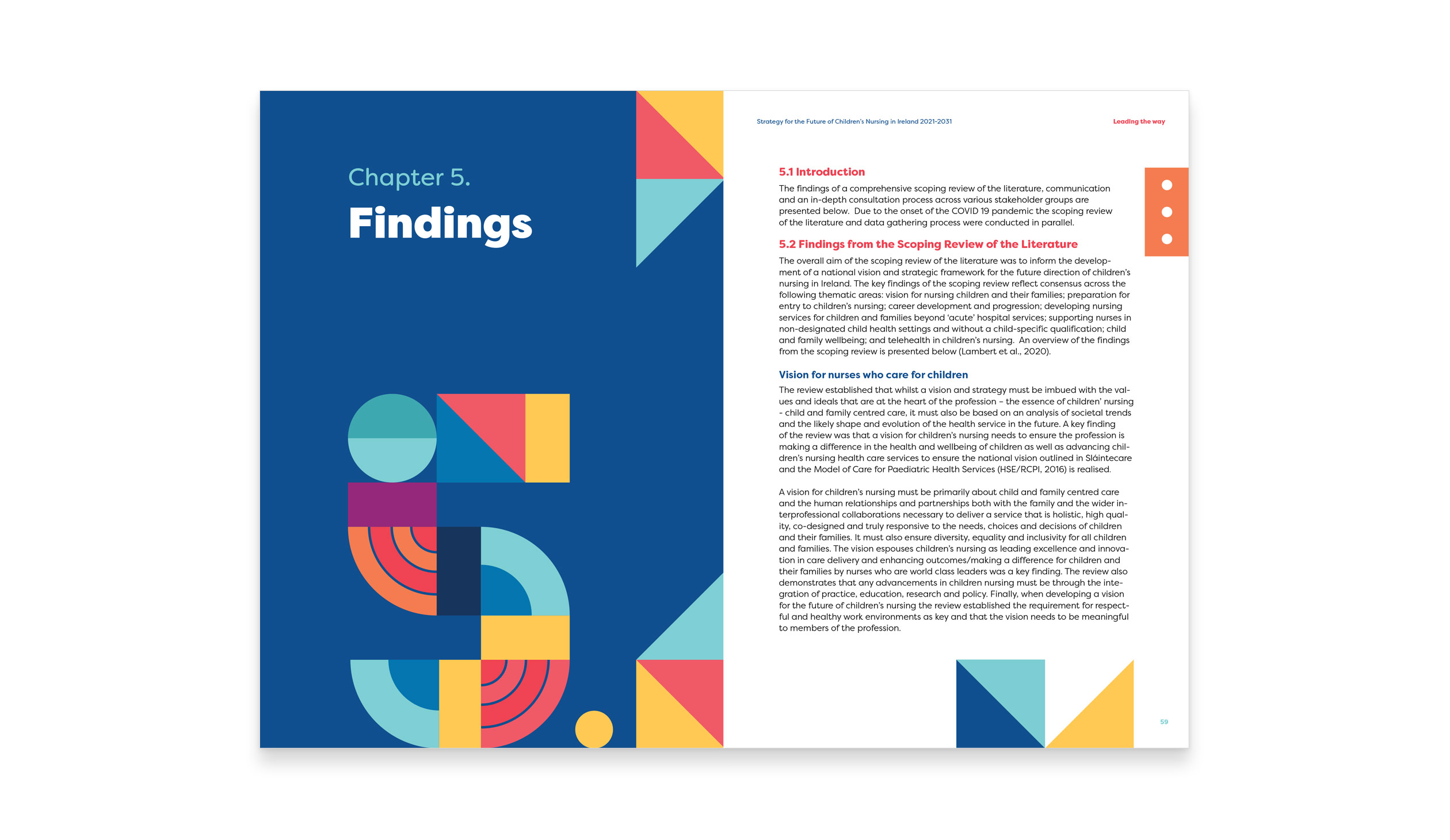
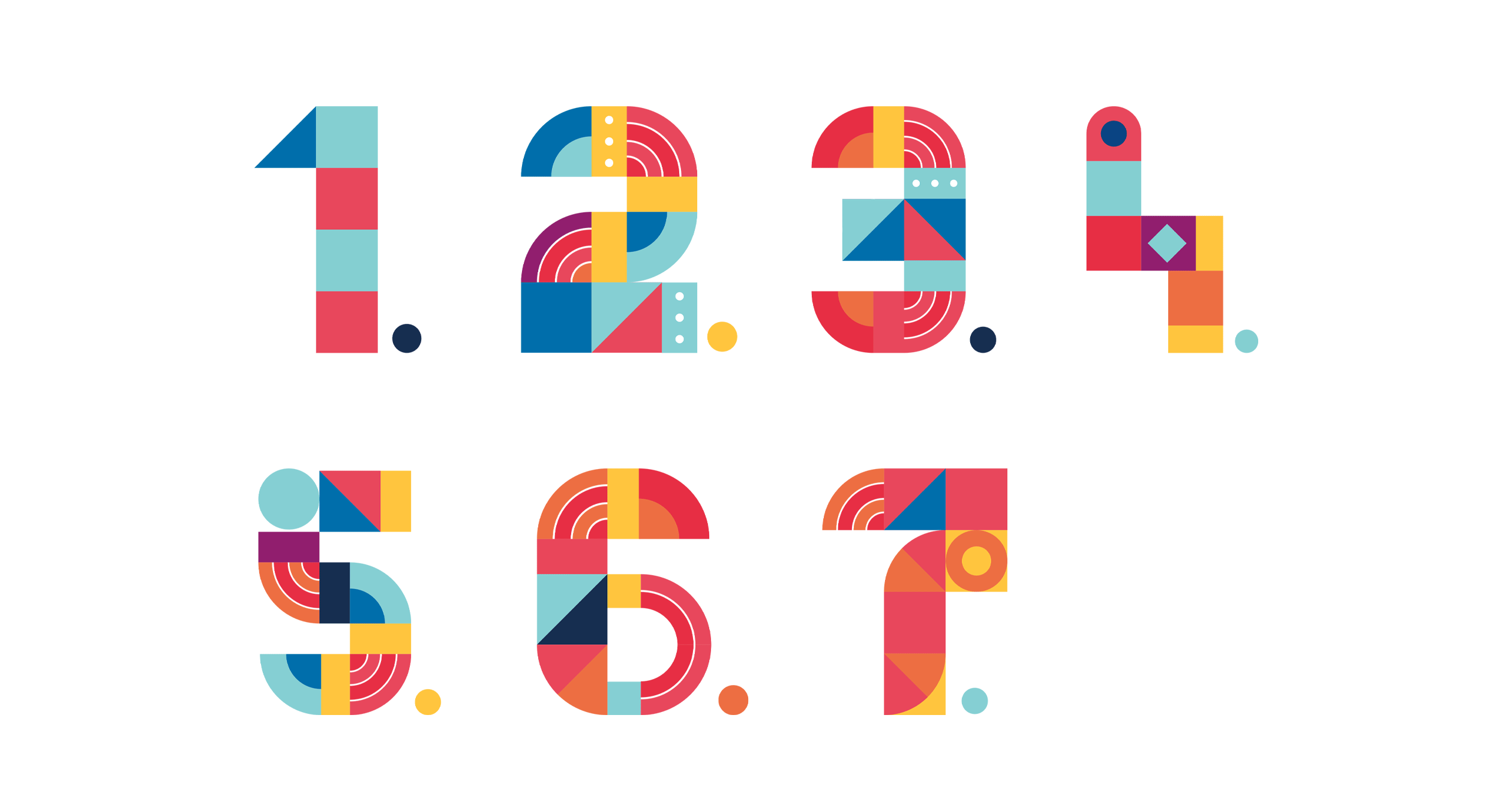
The report was divided into seven chapters, each focusing on a different aspect of CHI’s work. Each section further used the playful building bricks design language to create a large number. This was visually useful when the report was browsed or finding chapters easily, which was an important part of the brief. The agency used a consistent design language throughout the report, which helped to maintain a sense of coherence and clarity.

Conclusion
The final report was a success and received positive feedback from CHI and its stakeholders. The design helped to communicate CHI’s accomplishments in a clear and engaging way, highlighting the organisation’s impact on children’s health and well-being and became a valuable tool for the organisation’s fundraising and awareness-raising efforts.
The CHI annual report project was a great success for the design agency, as well as for CHI and showcased the value of effective graphic design in communicating complex and difficult information to a broad ranging audience including the service users and their families.