Magnify Marketing Agency
Magnify Marketing Agency was a small and passionate team who thrived on creativity and generating great solutions. As a team of dedicated and skilled professionals, we offered a comprehensive range of marketing services. From creative direction to project management to integrated digital campaigns and rebranding projects we worked successfully with a varied and eclectic client list.
I was brought in as the creative director to plan, execute and oversee all client design work. During my time there I was lucky to work with a broad range of businesses, start-ups, government agencies, local authorities, festivals, charities and Universities. I spearheaded all visual creative thinking and problem solving alongside the marketing team.
.
Creative Direction
Branding & Identity
Digital Strategy
Integrated Marketing
Project Management
01.
A wild identity for a new adventure park
Our client was in the process of building a new multimillion adventure park in the the west of Ireland. It’s location was nestled in beautiful native woods on the outskirts of Galway city.
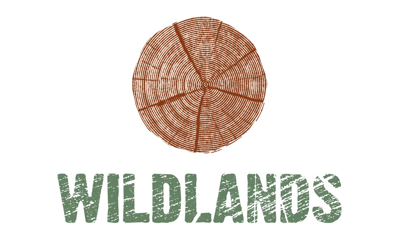
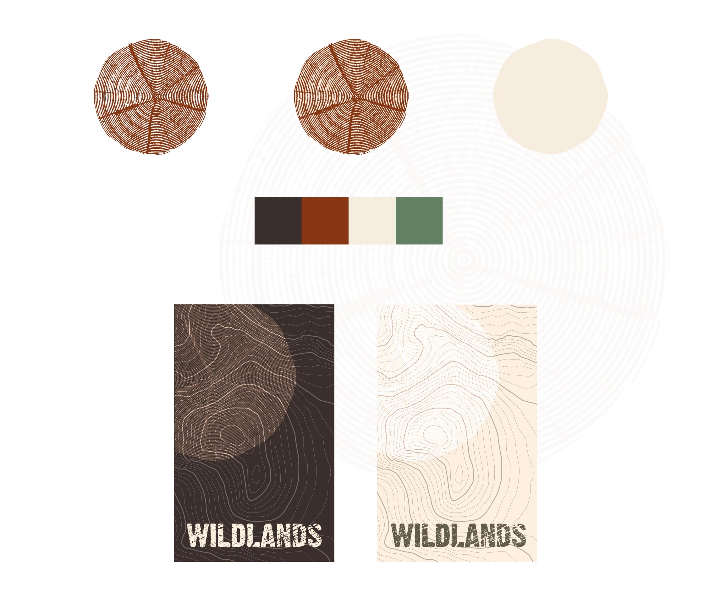
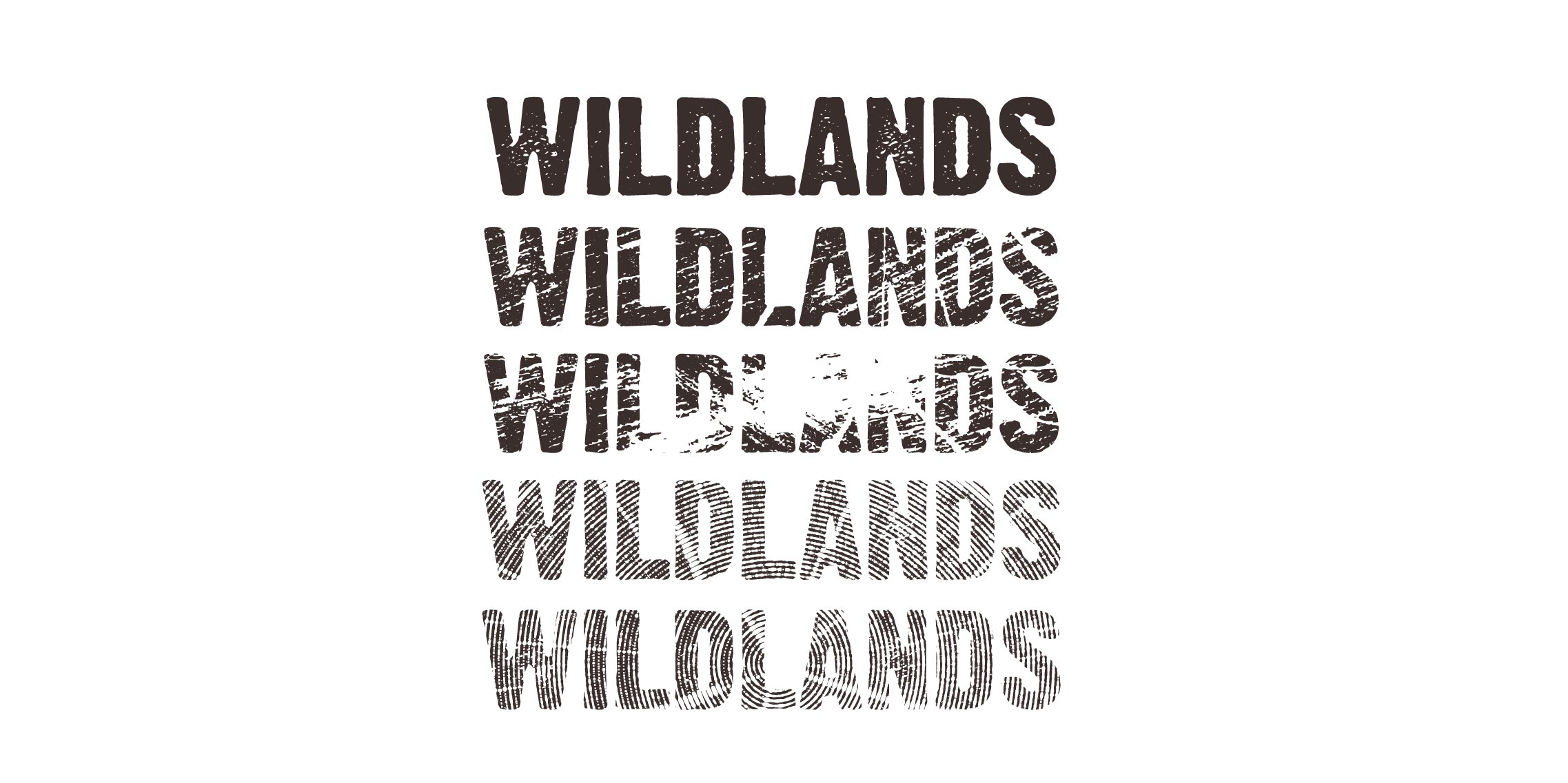
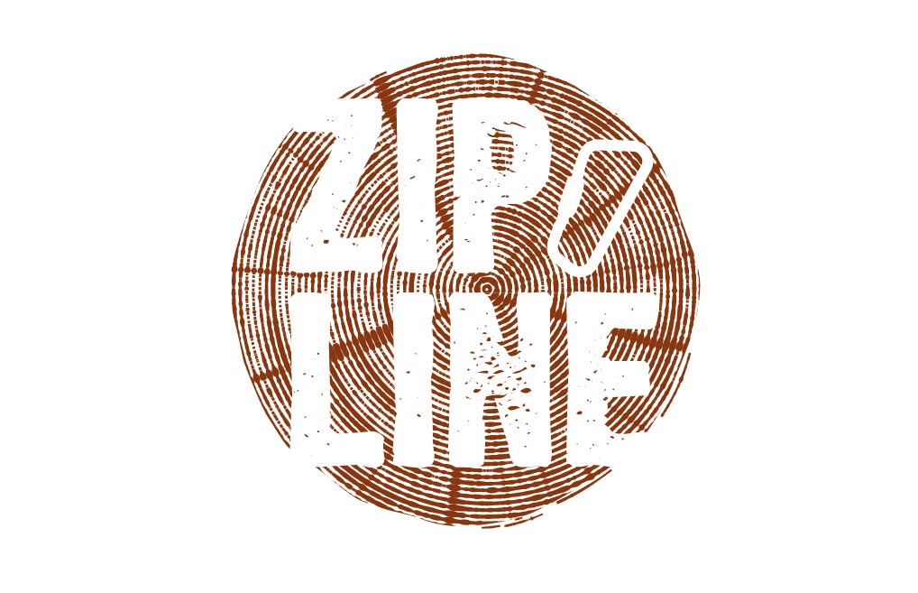
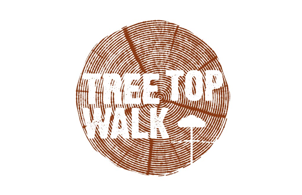
We went for a rough and ready handmade stressed approach that would help convey the woodlands surroundings. On a site visit I found a cut tree trunk that I thought would encapsulate the fledgling outdoor adventure centre perfectly. I mimicked the cut log back in the studio and created a range of grungy and stressed logotypes that could be used at different places in the park that could represent the level of any particular challenge.
Touchpoints: The tree rings provided a backdrop for many pieces of signage and could be used along with the map elevation graphic device I also created.
02.
Helping to sell a boutique housing development
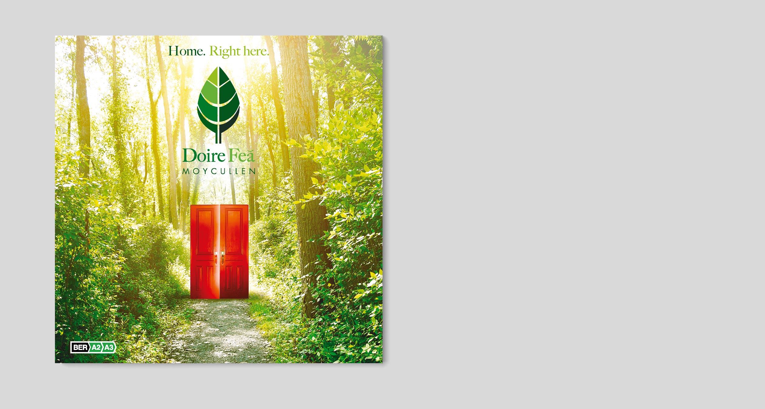
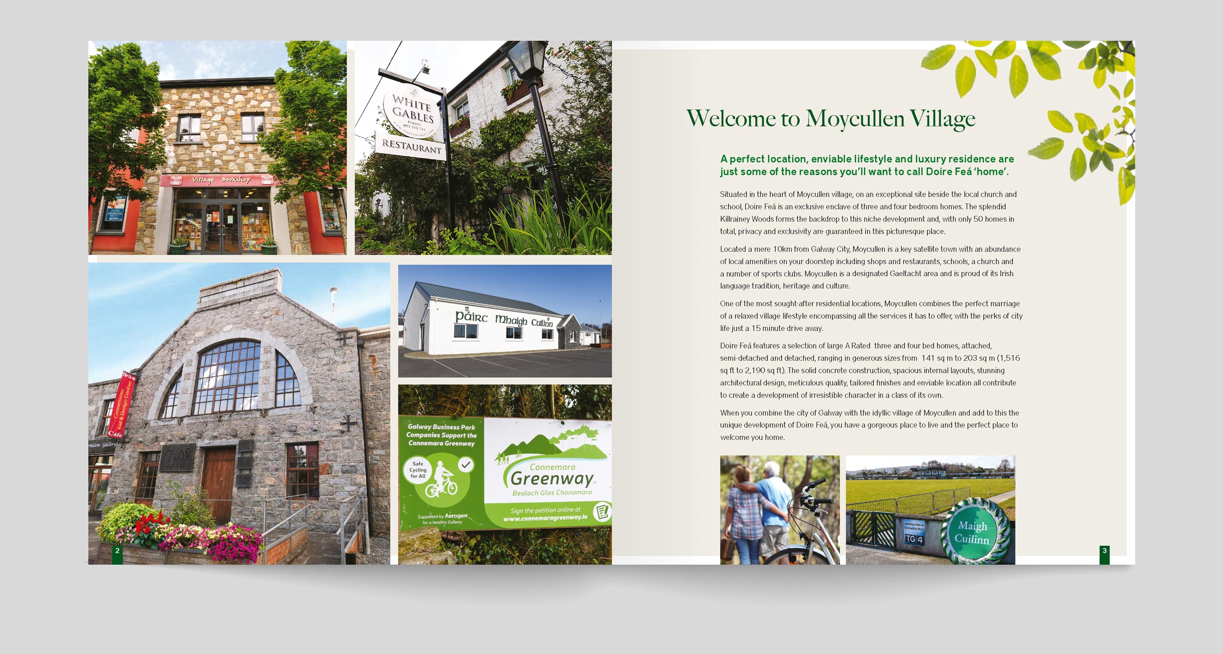
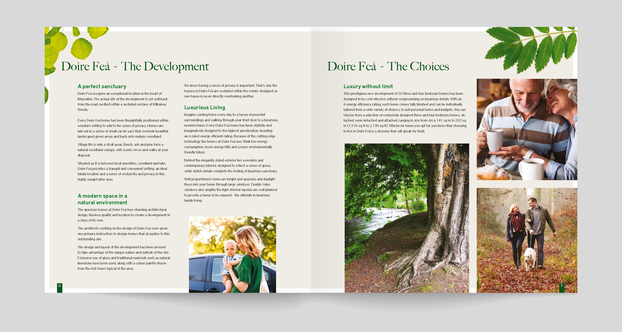
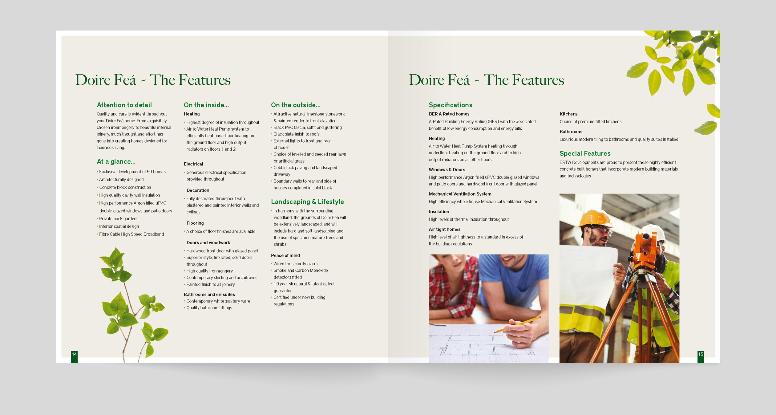
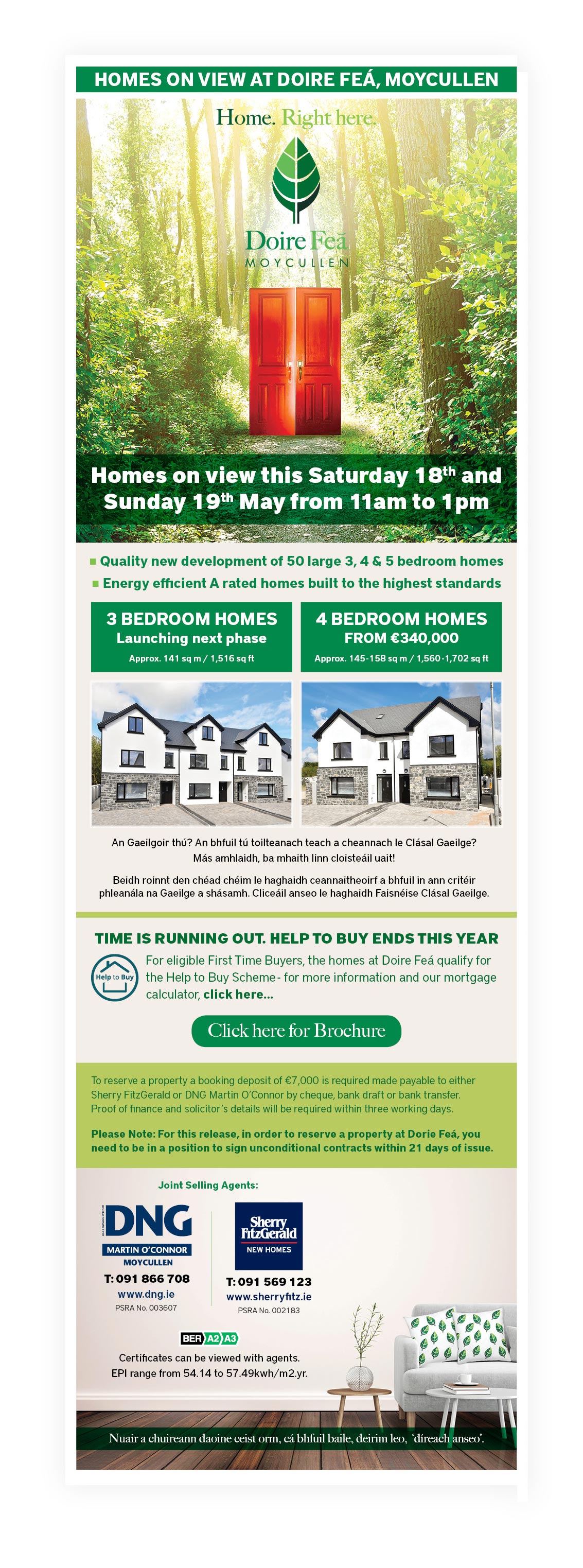
Doire Feá is an exclusive new development of 3, 4 & 5 bedroom family homes located in the heart of Moycullen Village, just 10km west from Galway city. Kilrainey Woods forms the backdrop to this exclusive development of only 50 homes.
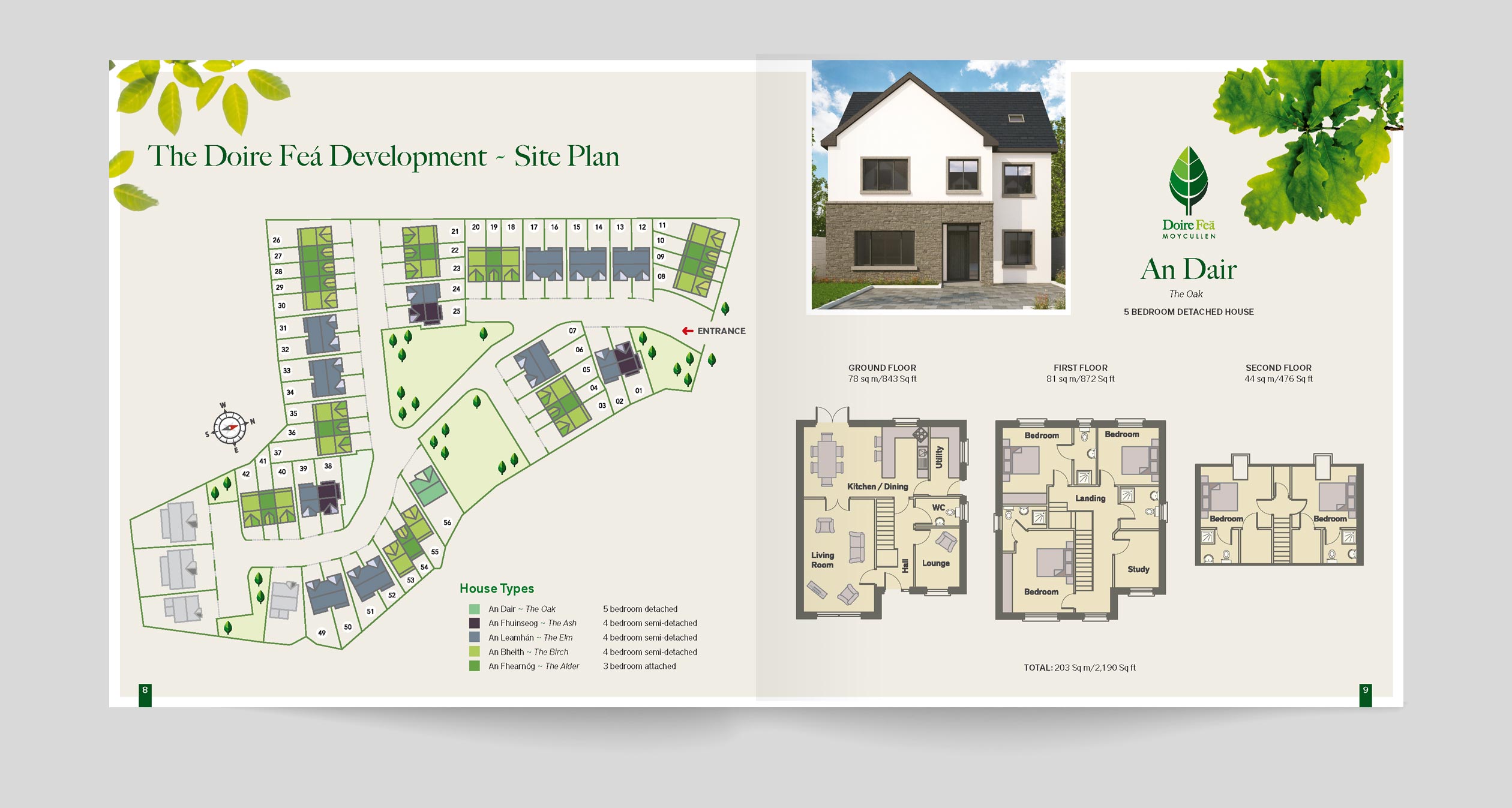
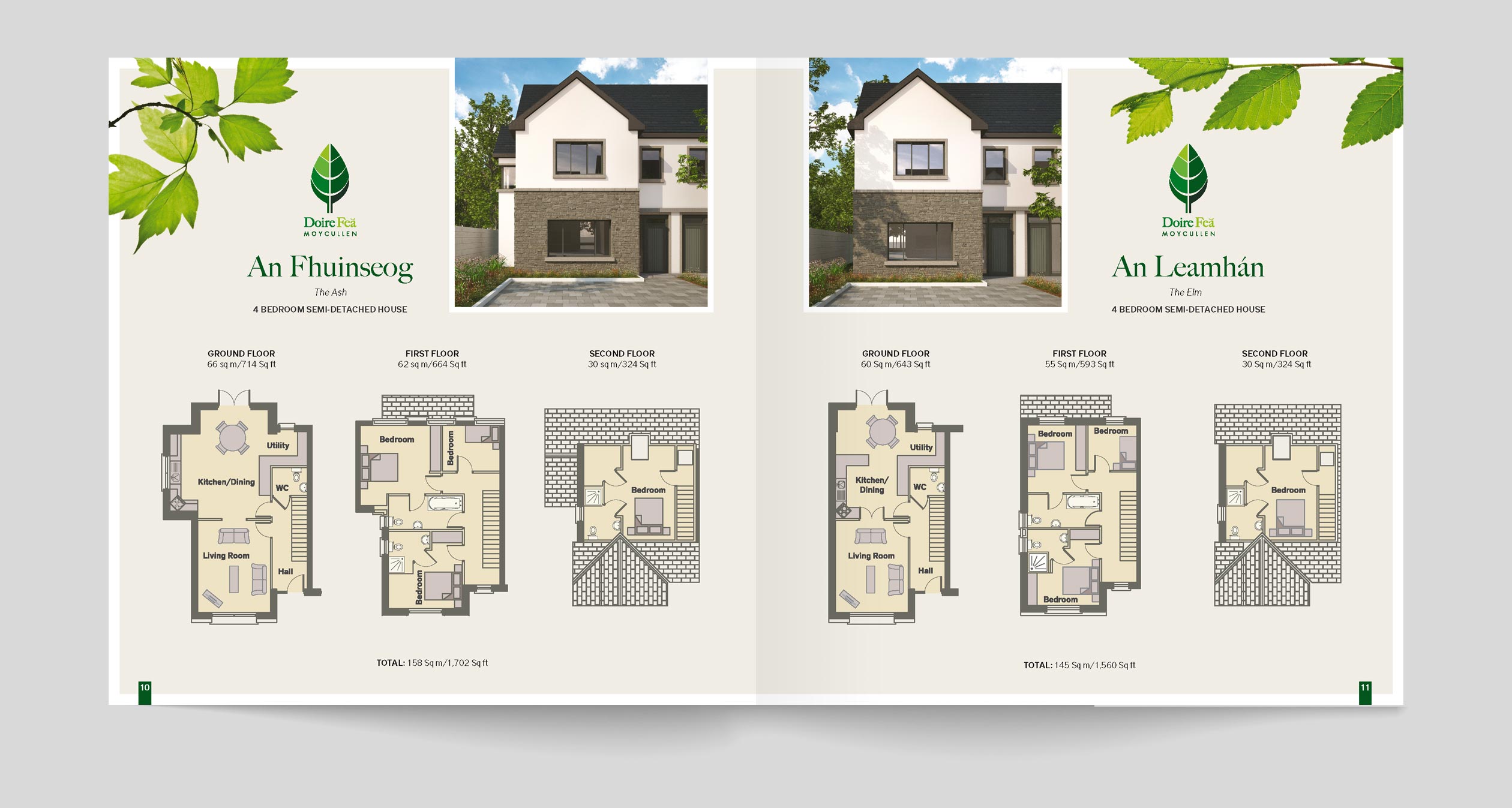
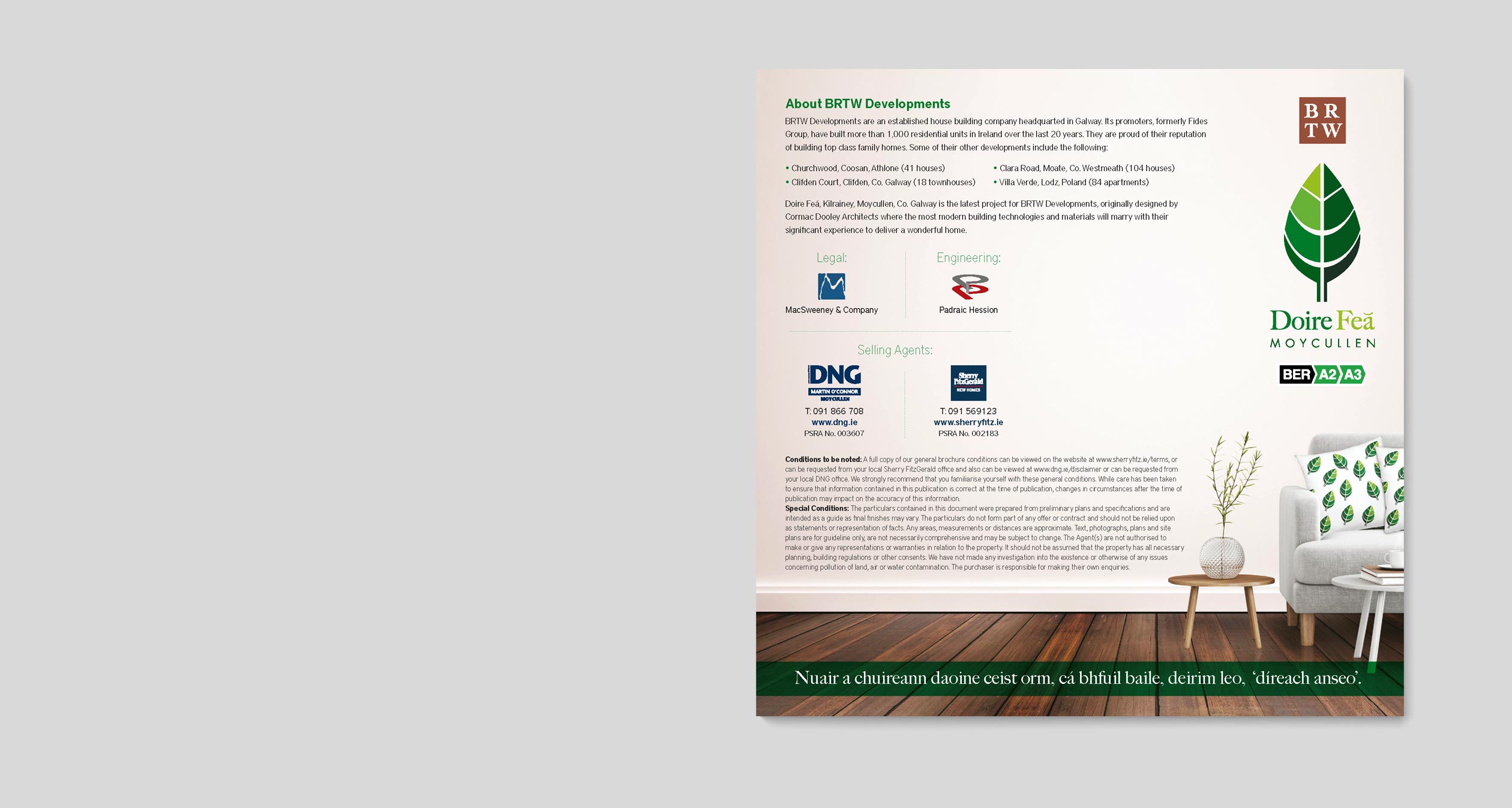
Doire Feá means ‘Beech Grove’ in the Irish language. Due to the semi rural nature of the development and its proximity to native Irish woodland I focused on using the leaves of the native trees that would represent the name of each type of house. The cover was produced to conjure up an emotional attachment to living close to such a beautiful part of the country. All maps and plans were specially designed to suit the colour scheme and mood of the brochure.
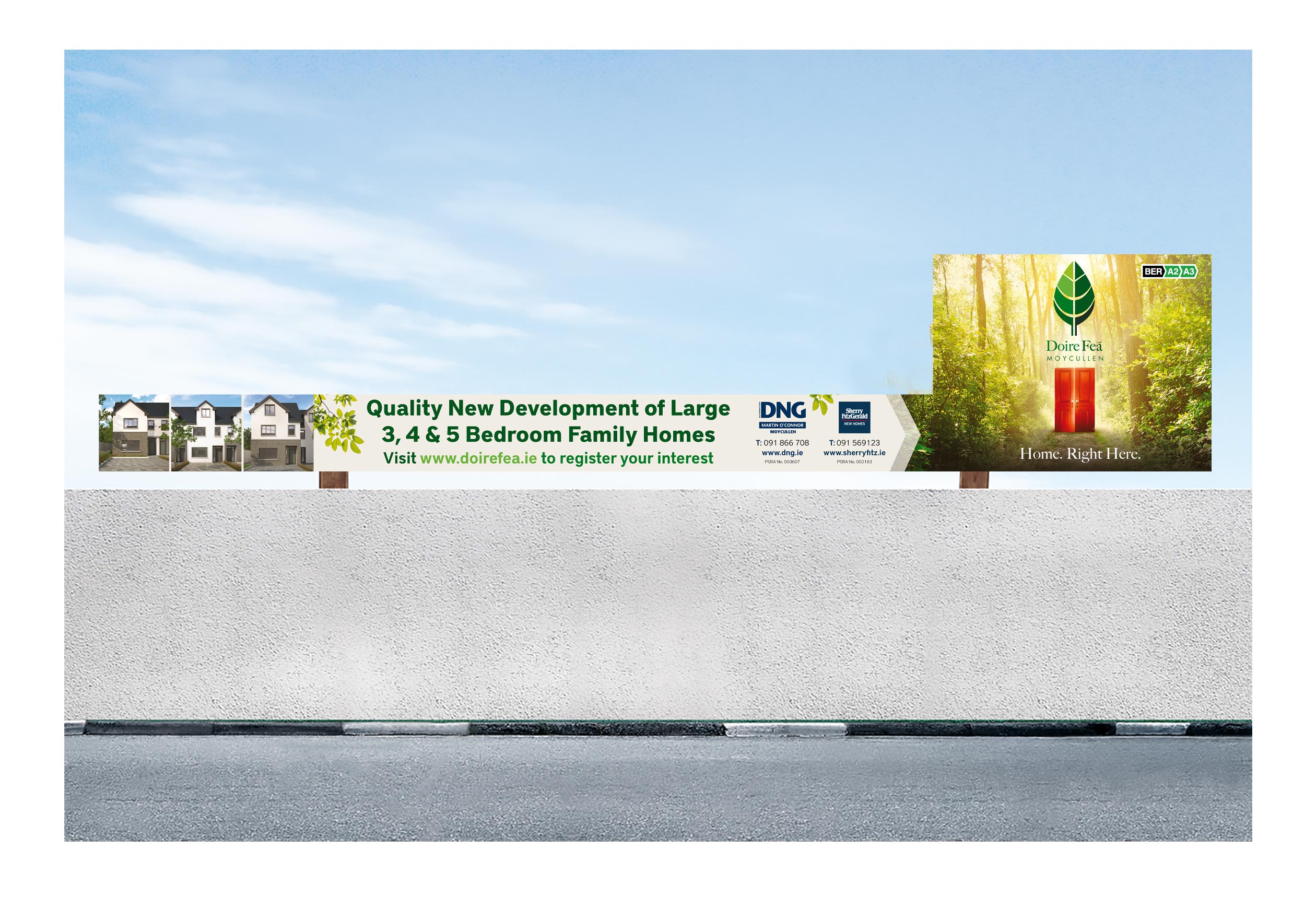
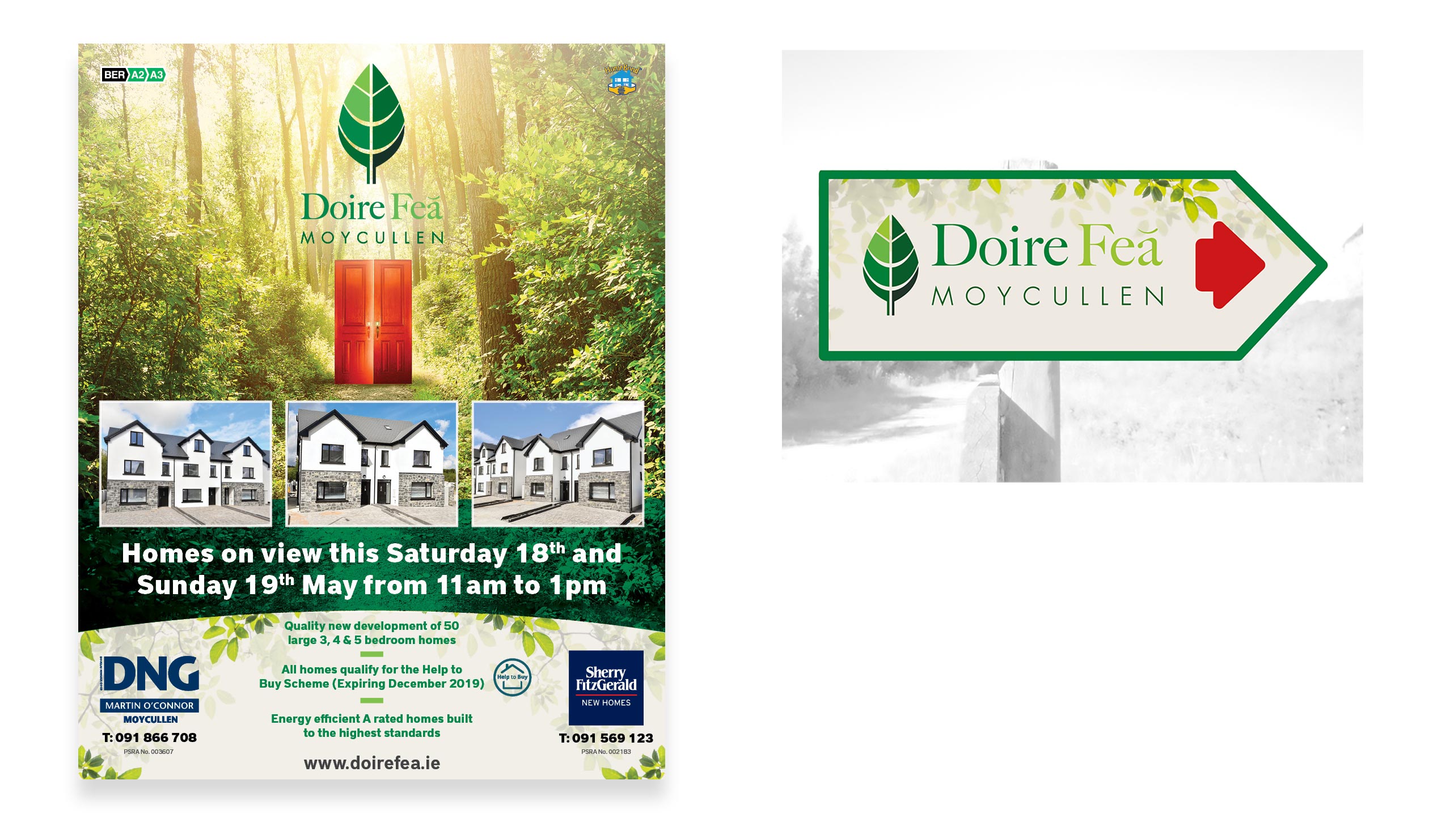
Support: Billboards (top), print advertisements and wayfaring signage (middle) and an EDM (bottom) where all designed to support the sales team.
03.
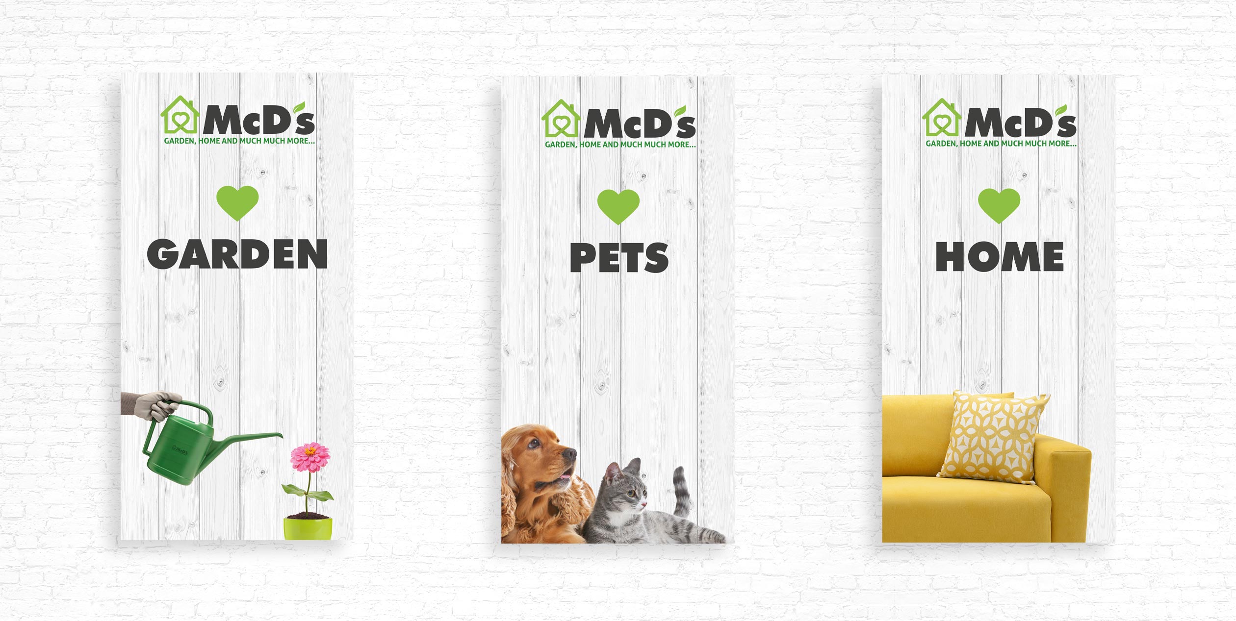
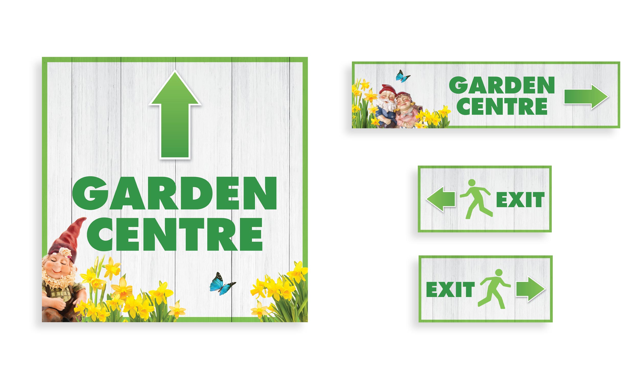
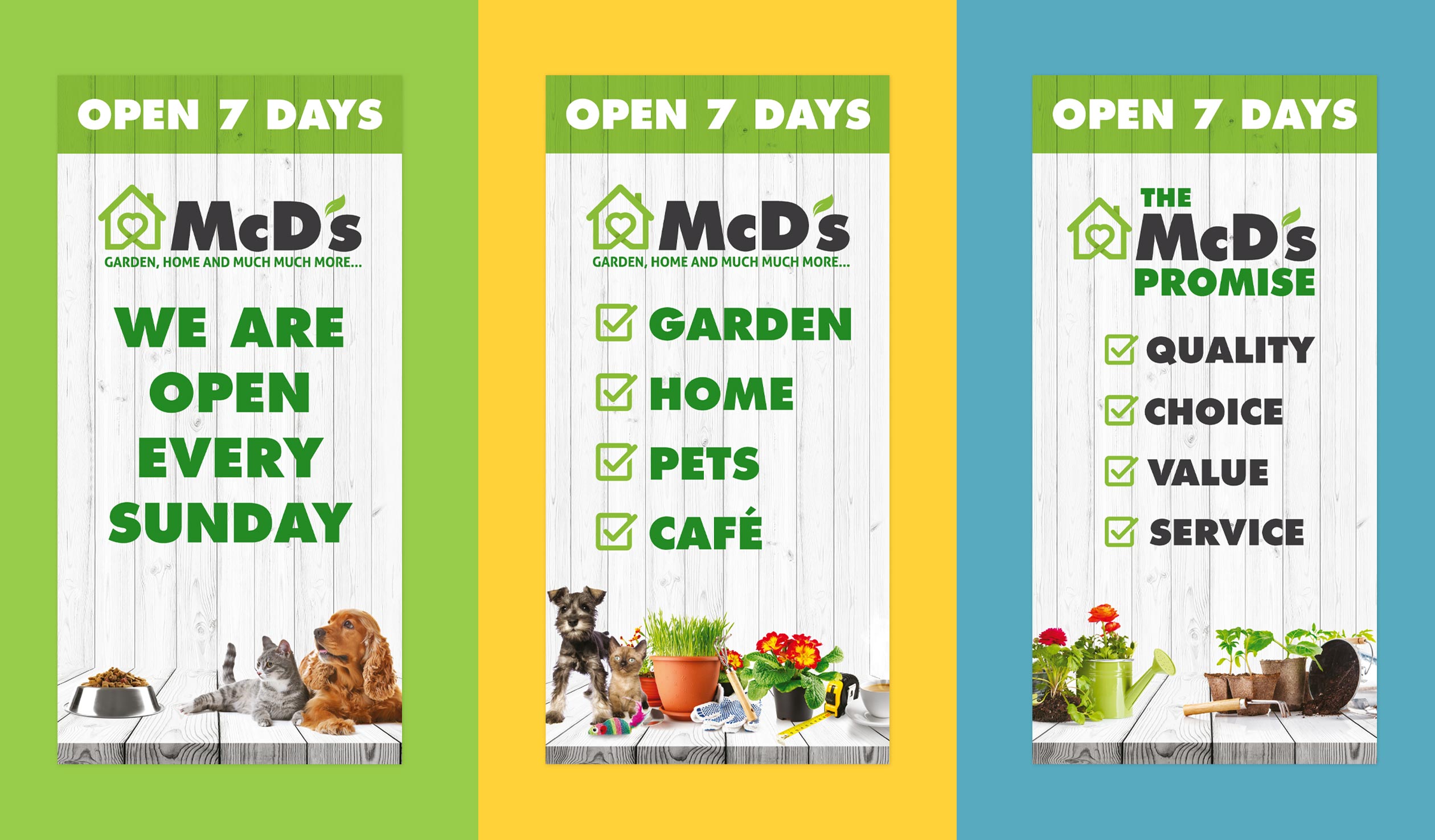
Rebrand for a growing home & garden retailer
The client was a leading home and garden retailer with big ambitions based in the west of Ireland. They specialise in providing customers with high-quality products and exceptional customer service.
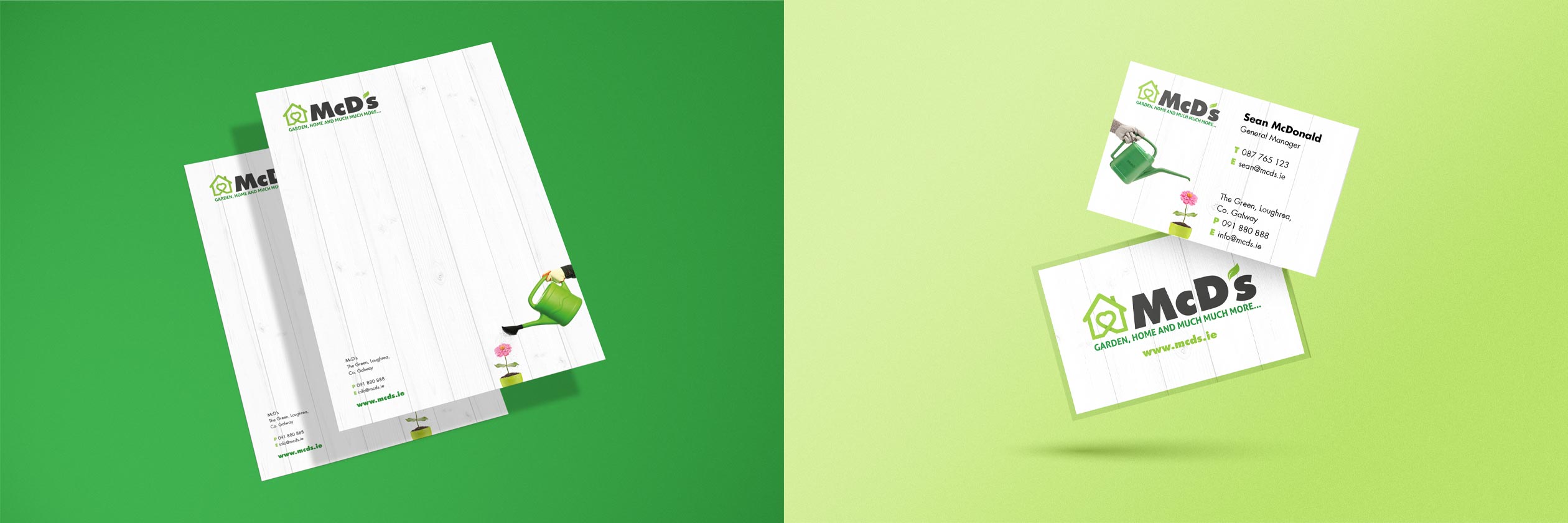
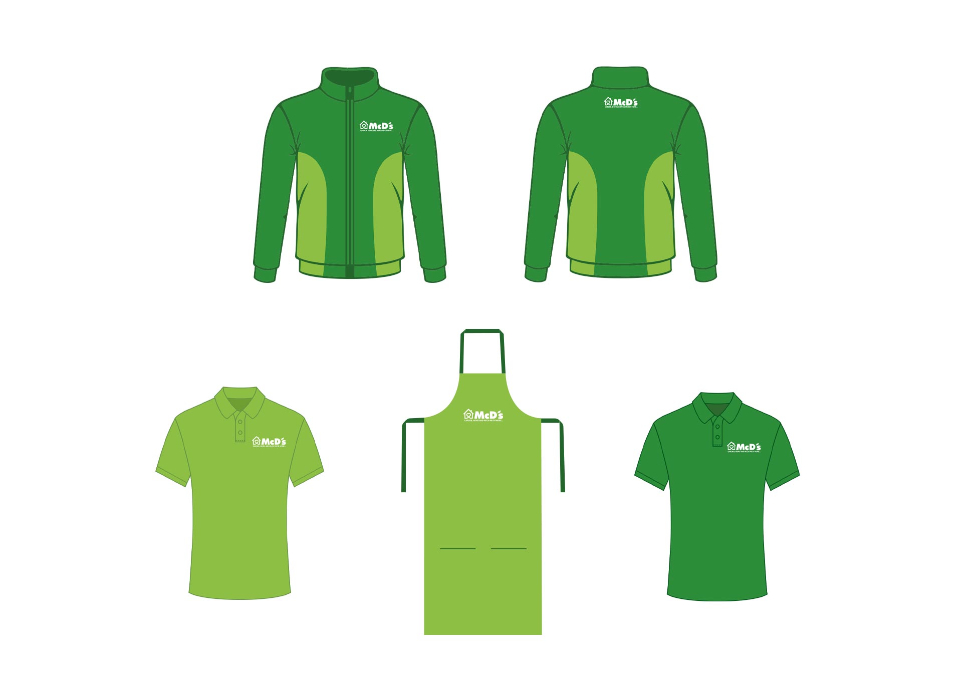
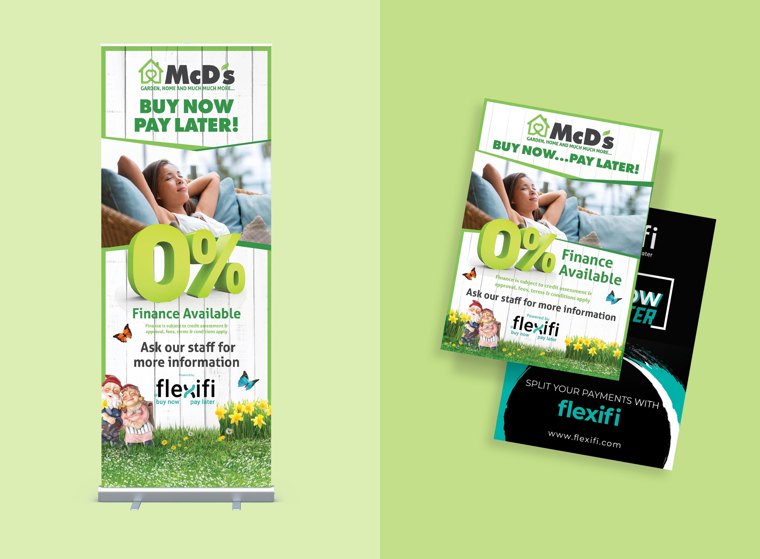
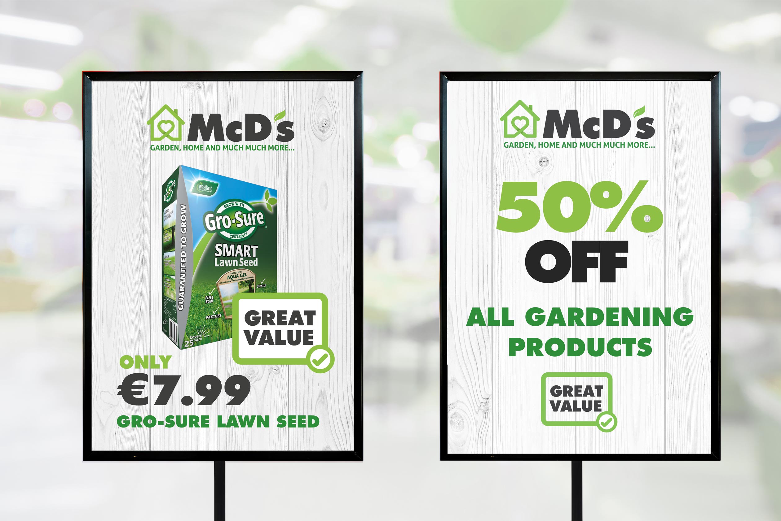
The client approached me with the challenge of designing a new visual identity for their brand moving it away from an old fashioned budget yellow and red logo. They wanted a fresh and modern look that would appeal to a younger demographic while still maintaining their traditional values and very loyal customer base.
Design language: All aspects of the new brand had to be designed cross the premises, a small proportion of which is represented here. Christmas campaigns and brochures, billboards, large scale signage, flags and in store promotional materials where also designed using the created visual language.
04.
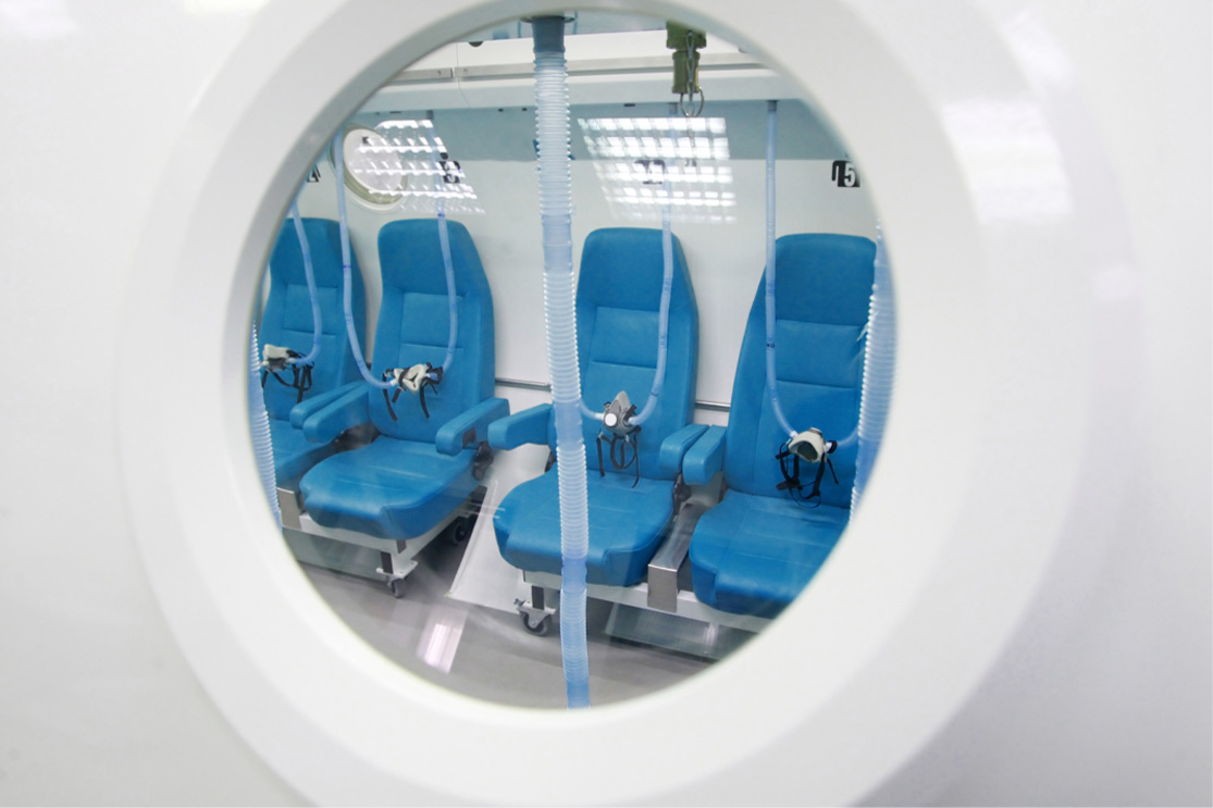
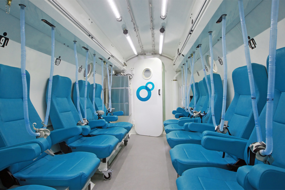
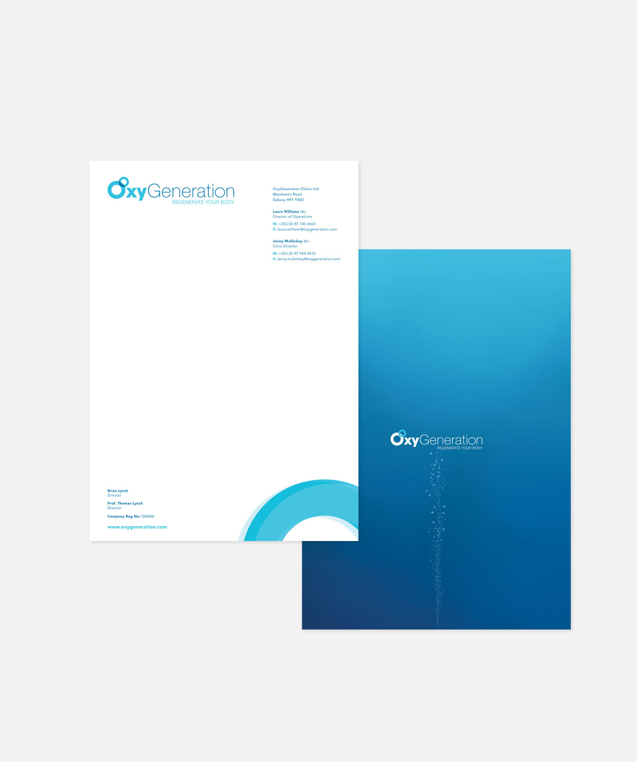
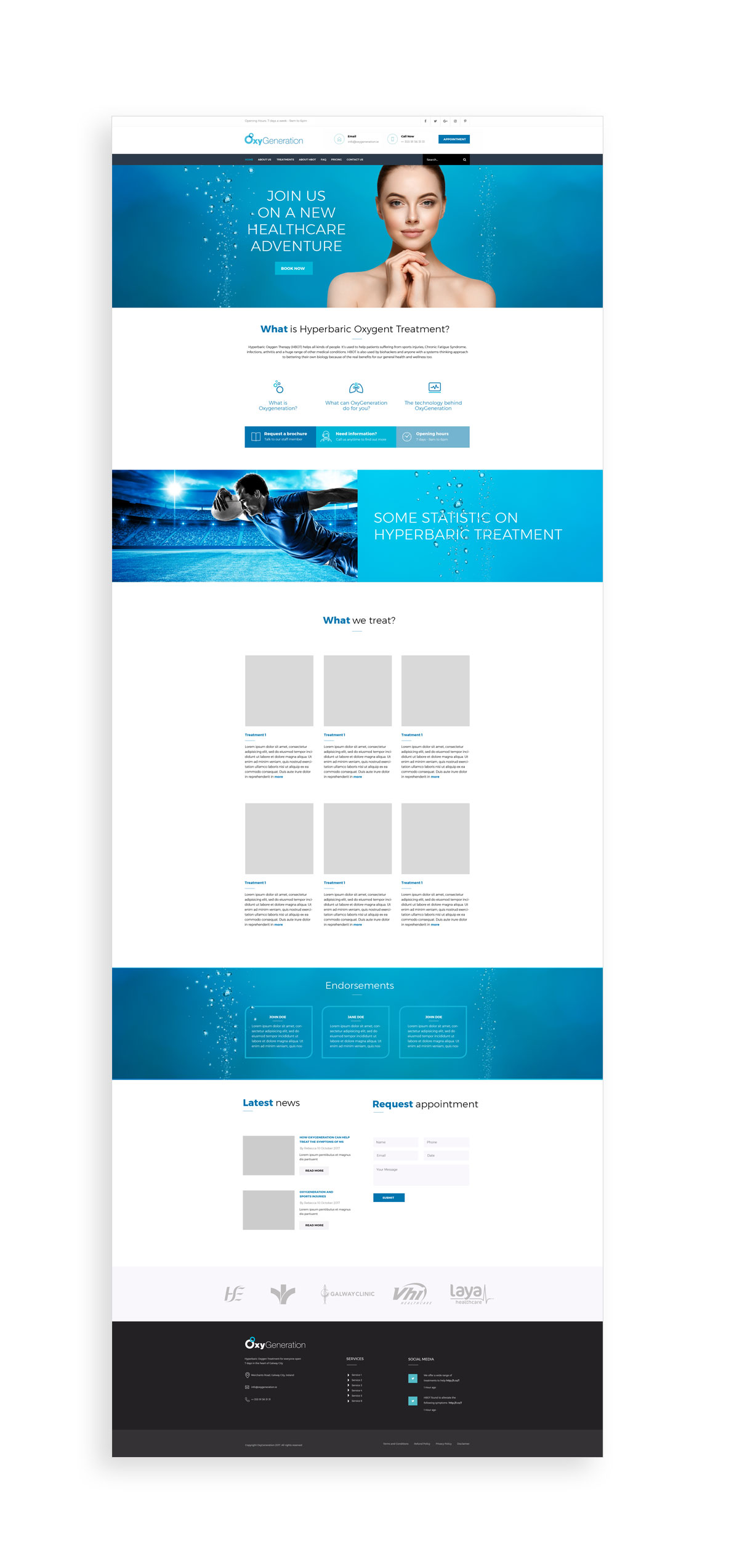
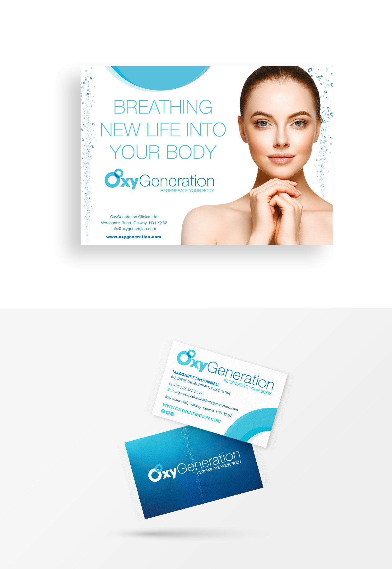
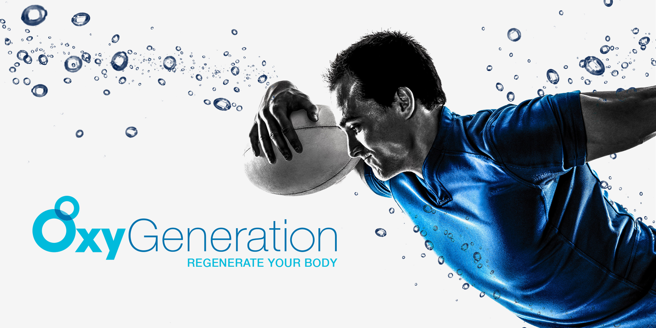
Clean identity for a new hyperbaric treatment business
Our client, a newly established private hyperbaric oxygenation therapy clinic in Ireland, approached our design agency to help create a visual identity and branding strategy that would help attract clients to a new idea in oxygen-based treatment. The clinic’s goal was to create a modern, professional, and welcoming brand that would appeal to a broad audience, while also showcasing their expertise and dedication to patient care.
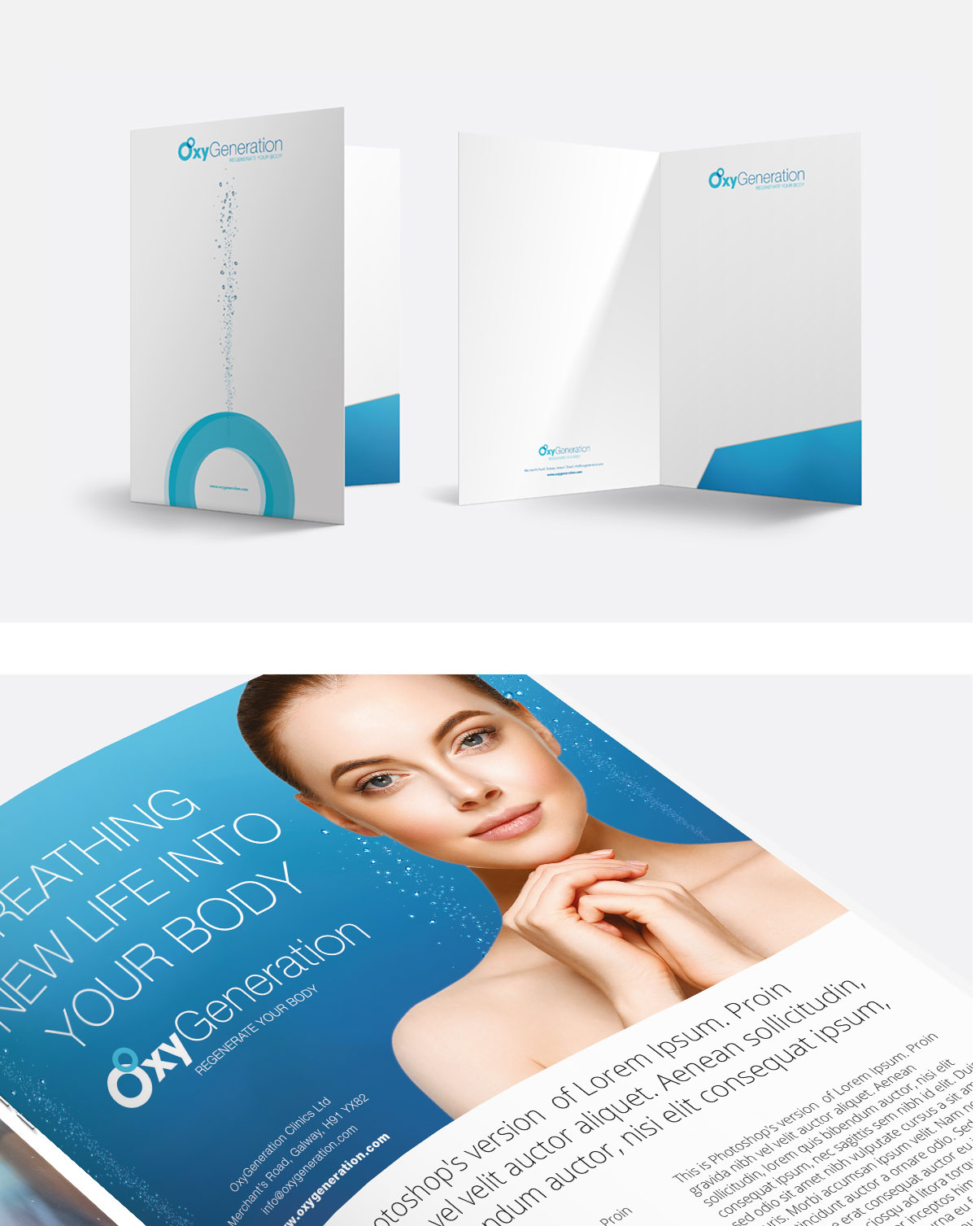
We opted for a clean and modern design approach that would convey the clinic’s commitment to quality and professionalism and selected a colour palette that was calming and inviting, using mainly shades of blue, evoking a sense of air, oxygen, healing, tranquillity, and nature.
Branding: All aspects of the new business required branding and identity applied including the website, icons and advertising and promotional collateral.
Conclusion
These are some of the projects completed by myself with Magnify. dna nightclub and venue was a huge design project in it’s own right and took many months. Market research, rebranding, customer and client experience and digital marketing for major festivals were some of the other projects I have worked on with Magnify and I will continue to add them to my portfolio in the coming weeks.
