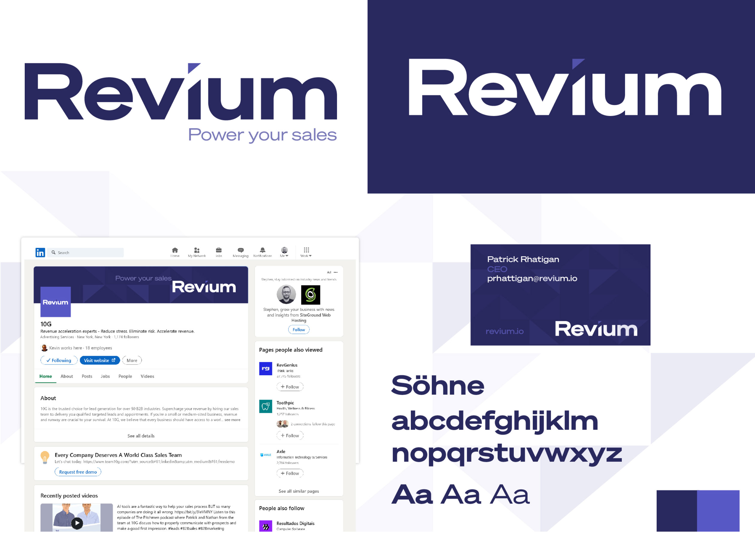
Revium
Revium, formally Team 10G, required design consultancy and visual help to first clarify their need for a name change and then to help envision and relaunch their new name into the fast moving world of Financial Technology. The client, a young, lean and dynamic FinTech start-up based in the US and Ireland, recognised the need for a powerful rebrand to launch their new name successfully. This was a collaborative project between myself, Revium and their in-house designer. They partnered with me to inject new ideas and guidance to a project they felt wasn’t going in the direction they wished. I was given a large scope and I was open to explore any avenues that I thought would work for them. After an exhaustive research process and many meetings and workshops with senior staff I set to work to help collaboratively bring Revium to the market.
.
Creative Direction
Branding & Identity
Collaboration,
Graphic Design
User Interface
Challenge
With a revolutionary product ready for the market, our client understood that a compelling brand image was the key to capturing the attention of potential investors and customers. The challenge was to create a fresh, memorable, and modern identity that conveyed innovation, trust, and reliability while resonating with their target audience of tech-savvy investors and finance enthusiasts.
Approach
At the core of this project was the essence of collaboration. We understood that a successful rebrand required a deep understanding of the client’s values, aspirations, and market positioning. I conducted intensive meetings and interviews with key stakeholders, including founders, developers, and marketers, to gain insights into the company’s culture and vision. Working particularly closely with the marketing manager we identified key insights and refined the brands mission statement, tone and attributes. A tagline was to be developed in tandem with the identity.
Analysis
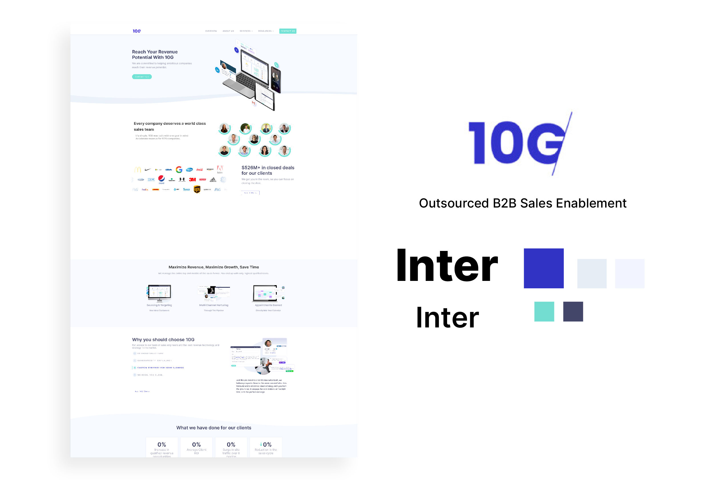
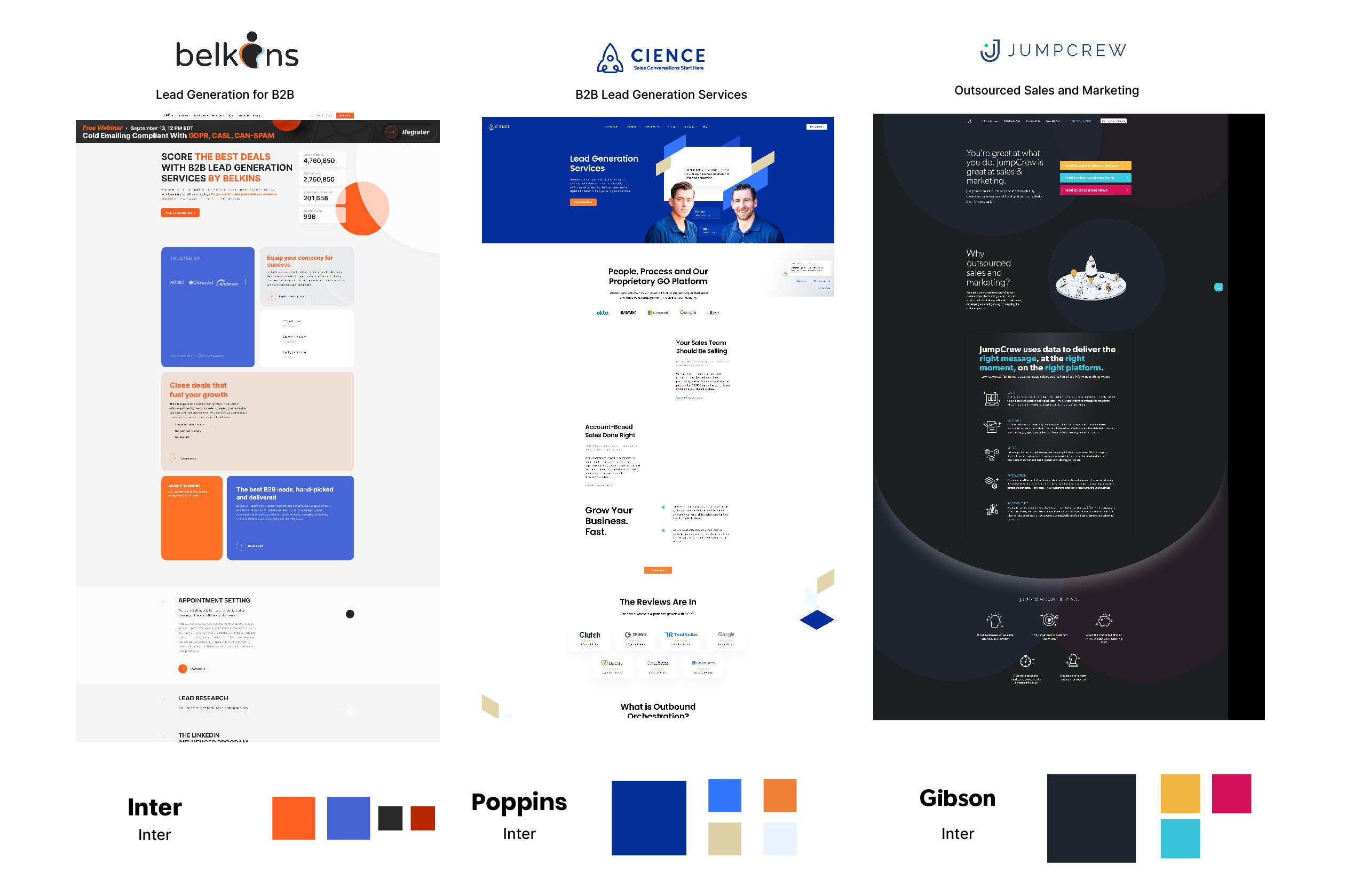
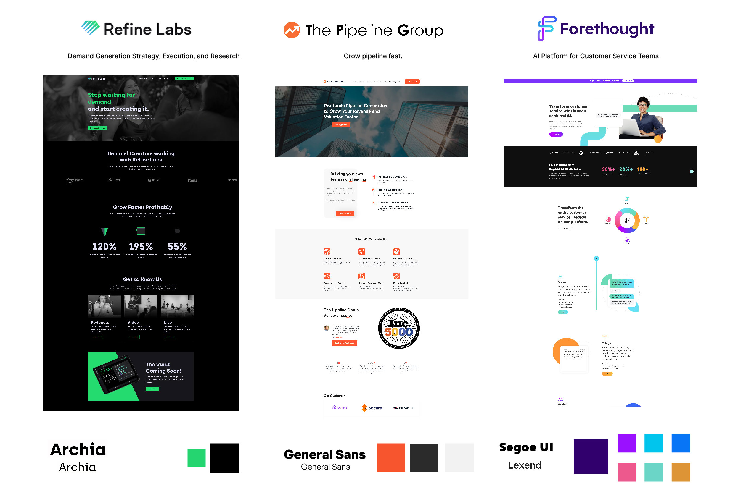
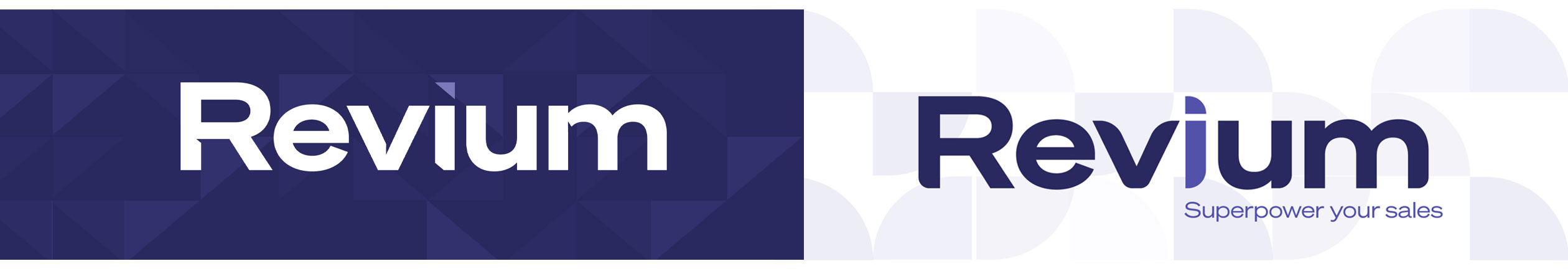
A deep dive analysis of the old 10G brand and it’s current positioning in the market was completed in collaboration with the marketing manager. Competitors where researched and surveyed in documented and visual detail to help find a positional fit. After many workshops and careful examination the 10G name was deemed not fit for purpose in the current tech landscape and replaced with the new name based off the keyword ‘revenue’: Revium.
Logo 01
The ‘Funnel’ logo
I was given full scope to explore how the new Revium brand might evolve and eventually look and feel. After a research and playful design stage I began to pull three threads out of my work. The first was the idea of the sales funnel mentioned that were mentioned in the workshops. Helping a business increase revenue through increasing the volume through it’s ales funnel was at the forefront of the technology and the people behind Revium.
Logo 02
The ‘Logotype’ logo
The CEO and CTO thought a simple logotype might work for them and asked me to come up with some ideas. Ultimately the logotype idea was rejected as the brand felt the combination of a logomark and logotype was the best way forward for their new identity.
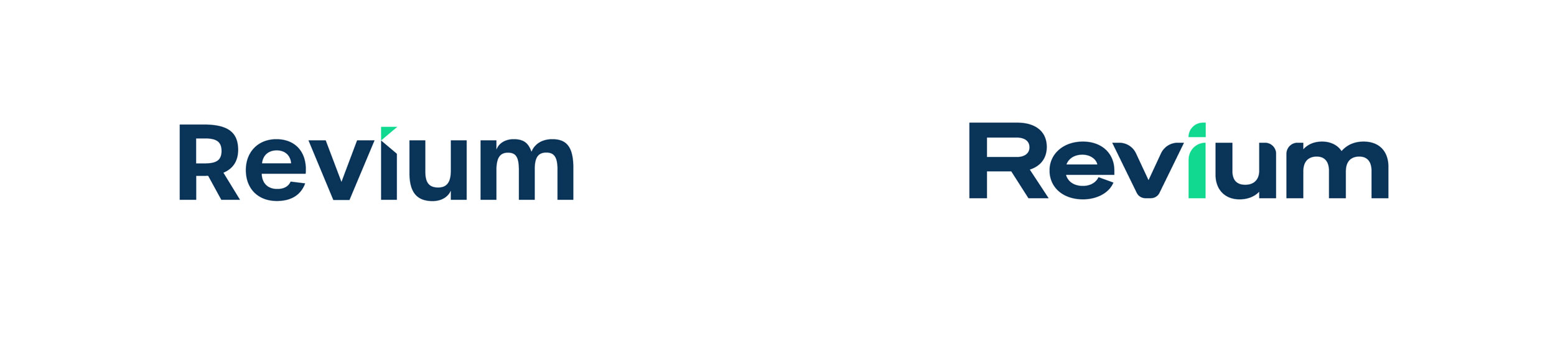
Logo 03
The ‘R’ logo
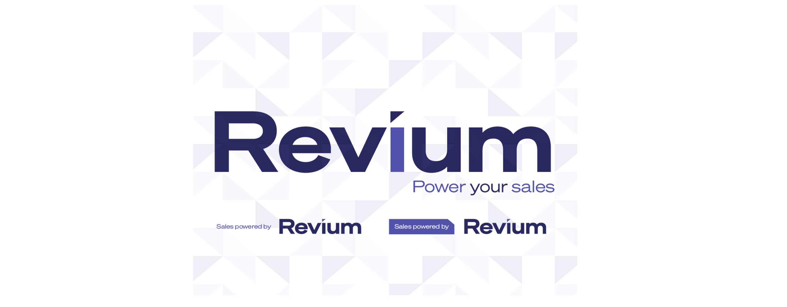
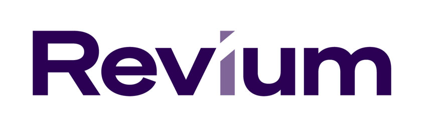
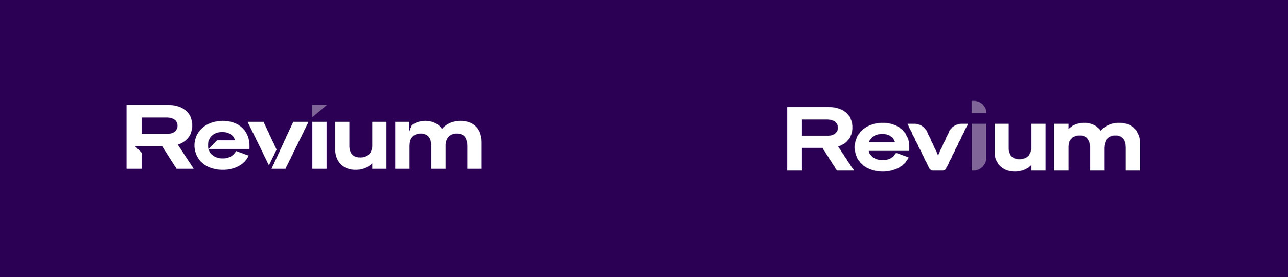
Due to the unique and completely made up new business name I decided to take the ‘R’ of Revium and trying to push it as a logomark. This idea gathered momentum and a version of one of the many logomarks created in this phase of work was slightly reworked and chosen as the final logo.
Logo 04
The ‘Slash’ logo
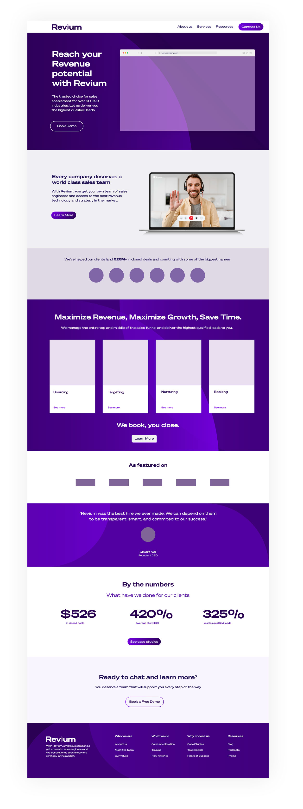
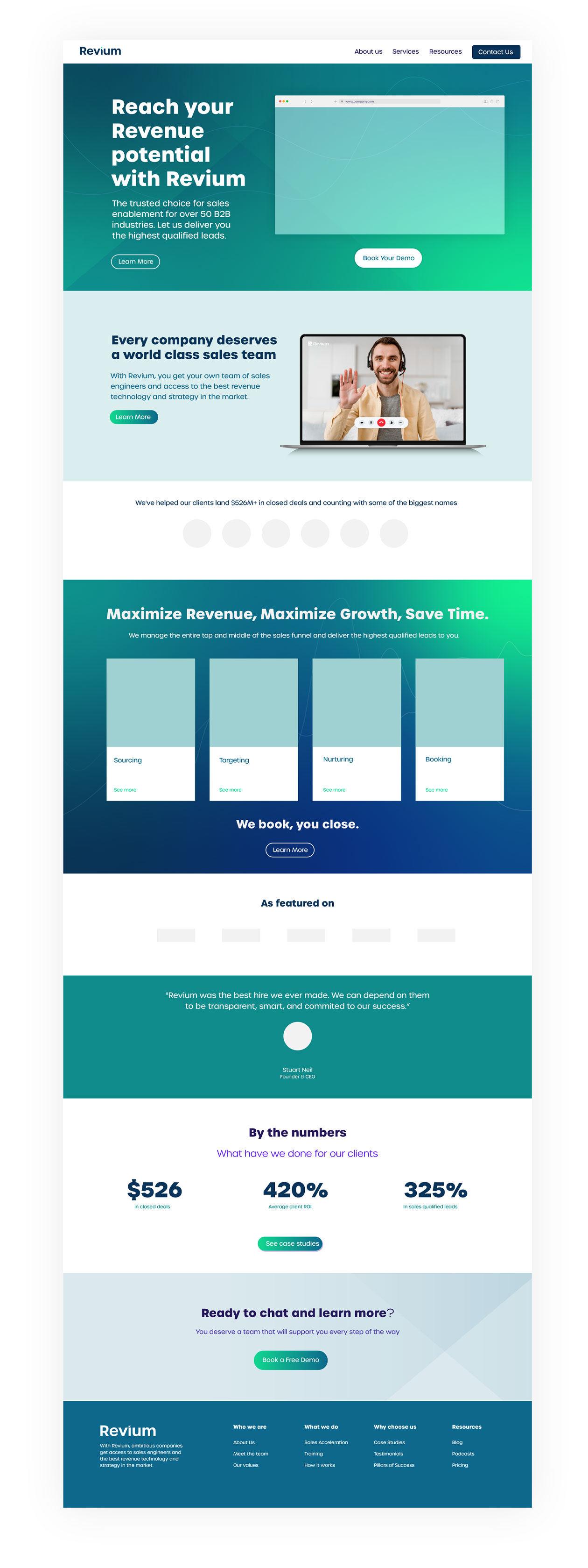
As my time with the project was running out I threw one last idea into the pitch. Taking a few steps backwards I pared, slimmed and thinned everything down to create a logo with a little more elegance and sophistication to reflect several of the keywords identified in an early workshop to describe this fledgling business. The ‘slash’ logomark was born out of the idea of something dynamically rising like a spike on a company sales chart. It also represented an italicised cursor to acknowledge the technological side of the brand. This created a simple graphic device to use across all aspects of the brand. It could be expanded and narrowed as required for effect and was simple to animate.
Google Ads: To help sell the idea I mocked up Google Display Network and social media ads.
Outcome
Using good research, being allowed plenty of scope I was able to take the brand on an exploratory journey that resulted in the companies in-house designer melding several of my ideas together to create a logo that the CEO was satisfied with.