Tipple
Tipple’s aim is to provide a toolkit for selling alcohol online compliantly by solving problems that alcohol brands might experience when selling alcohol D2C and D2B.
Tipple connects to existing websites as a plug-in and has e-commerce integration. It’s a platform for global customers selling drinks brands to scale sales into countries by directly selling to consumers.
As well as B2C and D2C alcohol sales Tipple is also starting to make plans for the B2B alcohol sales and distribution market and are planning their own website and platform for large volume sales and distribution of wines and spirits.
.
UX
Research
Wireframe
The Project
When I first talked to Tipple they were at the beginning of a spin-off project based off the back of their Business-to-Consumer (B2C) and Direct-to-Consumer (D2C) platforms. The project was to create an online platform for Business-to-Business (B2B) alcohol sales, warehousing and distribution. This project was at the very early investigatory stages and very little research and work had taken place. I was given quite an open U brief to have a look at how a business customer might begin to look at placing an order of alcohol online with a Tipple B2B website.
Key tasks
I was to use UX processes to investigate how a customer might begin to interact and use a B2B website. Due to the early stages of the project I had great flexibility in what UX tools I would use. I broke the project down into two phases:
Phase 1: Discover and Explore
This included research into Tipple, the online alcohol sales sector, the competition and the customer base. A problem statement was generated in this part of the project and various UX processes where used to help with setting up the next phase. Interviews were carried out with the major stakeholders and a few potential users.
Phase 2: Ideate and build
Phase 2 began with the creation of a user journey and user flow on which I was to base the wire-frame prototype for the Tipple website. Further visual research was carried out to help me with the design of the wire-frame.
Research
I began Phase I of the project by brainstorming on Miro. I like to try and explode all of the connections and touchpoint a business might have. This resulted in quite an extensive spider graph and helped me to get an overview of the business and many entities and complexities potentially involved. It also provided provided fundamental research and a contextual platform on which to understand the business better.
Other tools like generating a Projects Requirement Gathering 4-square and a Business Model Canvas helped with further understanding of the project and the business and to give me some parameters to work within.
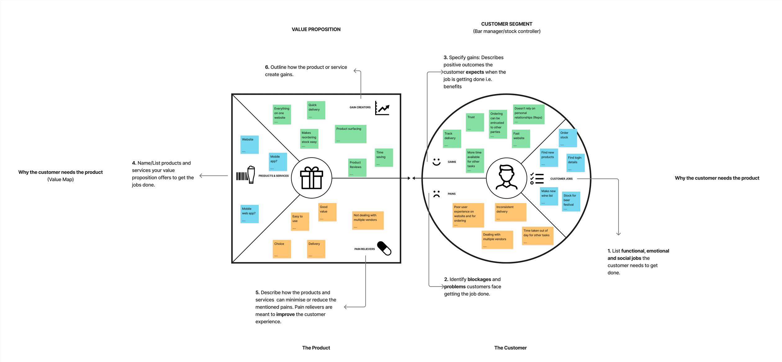
Using deep dive research into competitors helped me forward with the next stage in the project which involved trying to understand the B2B user and potential customers of Tipple. Through a simple Empathy Map I could start to see who the users might be and get an idea of where to go with persona development. This also proved important as I began to think about the generation of a key problem statement which was a keystone in the project. Compiling a UX Strategy Blueprint and Value Proposition Mapping were a further tools used to look into where value can be added in the experience for the user and also uncovering more potential issues and pain points.
Competitor Research
Empathy Mapping
UX Strategy Blueprint
Value Proposition Mapping
User Personas
Problem Statement
After completing detailed User Persona’s using all of the previous research and tools I felt I could nail down a very simple Problem Statement:
How can Tipple make it easy for businesses to plan and make purchases of wine and spirits by the case online.
Before continuing to Phase II I was asked if I could take a less detailed approach with the user personas and distil them down into more generalised and less granular User Archetypes:
Phase II
Phase II began with an attempt to further get into the mind of the user and the business by putting together a User Journey. From this I extrpolated two basic User Flows on which to base my wire-frames for Tipple. The Prototyping Wire-frames were the last part of the project and were based off in-depth visual research on direct competitors, international online alcohol sales websites and on more concept based design sites like Dribbble and Behance.
Using the user flow as the base for a customer journey through a simple interaction with the website my wire-frame tested the users login/sign up through to adding a gin to a wishlist they were making for a Gin Festival.
User Journey
User Flow
Outcome
As the project was at very early stages for Tipple I felt any work I could do would be useful and add value as it got off the ground. The research highlighted websites and businesses that worked well and those that did not. The Value Proposition Canvas was of particular use to my project supervisor. The resulting wire-frames offers a working visual model on which to open a discussion for Tipple on how the user might interact with the website and offer design considerations and elements perhaps not thought about in the planning stages of this project.
Overall the supervisor was very happy with the work carried out for the business and Tipple continues to grow it’s base business and attract investors for this new phases of the companies plans.


